Update Cabela's account creation experience and process.
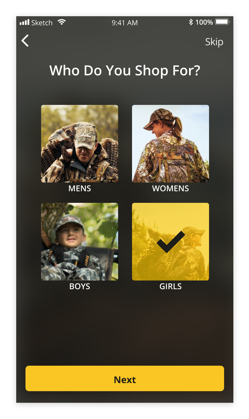
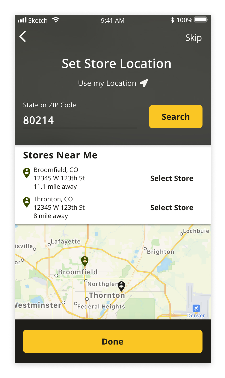
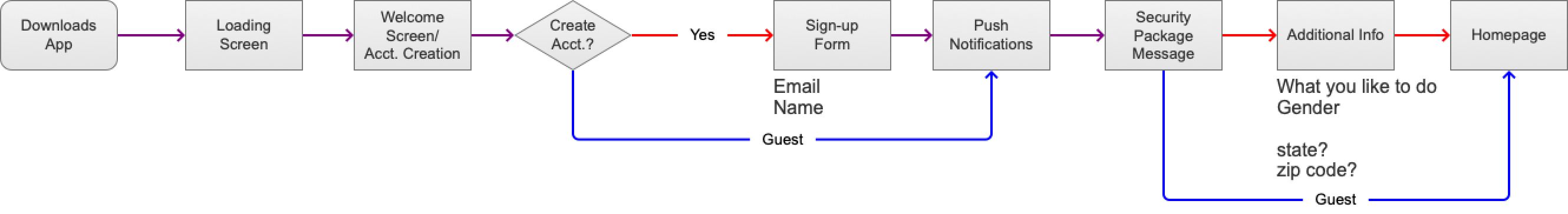
FIRST TIME OPENING THE APP
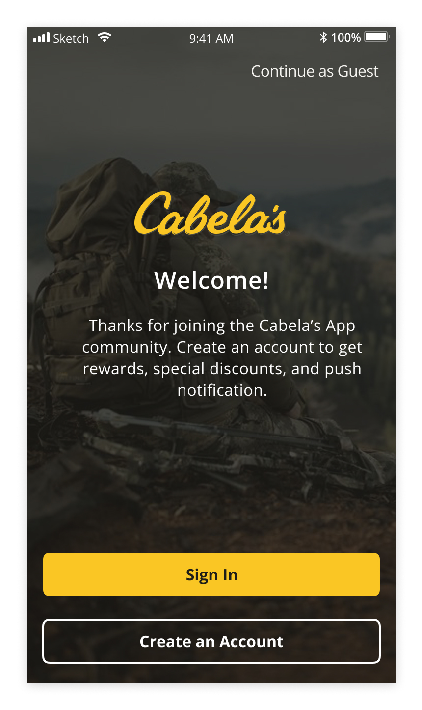
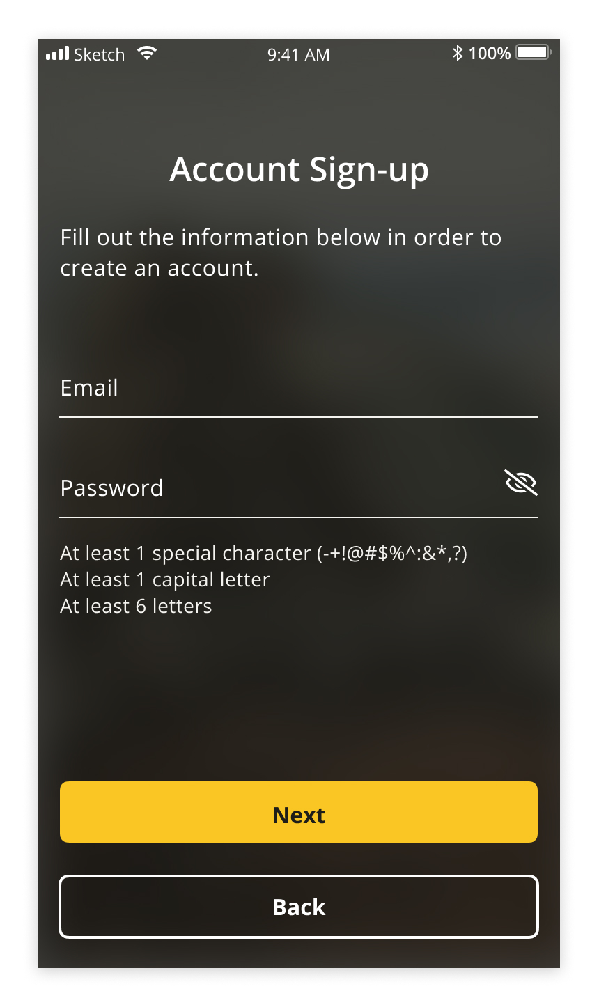
Below represents the flow of a user downloading the app and opening it for the first time.
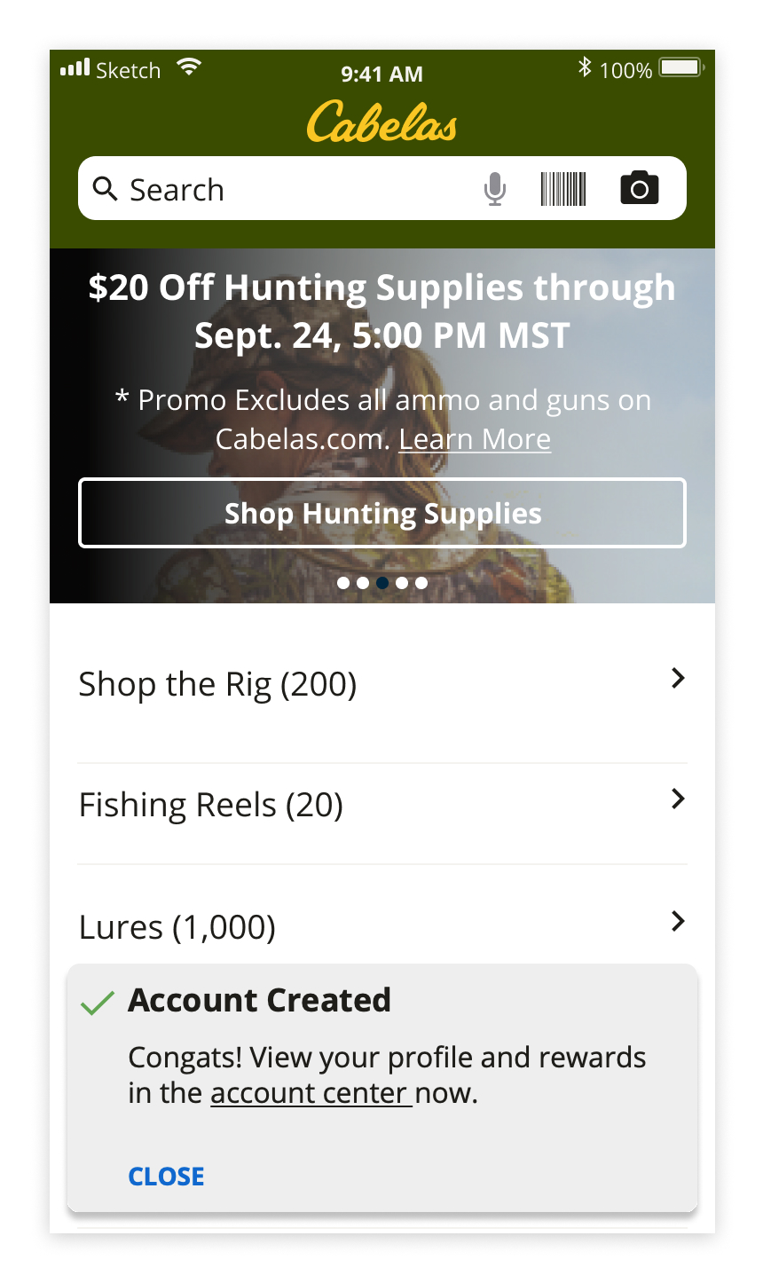
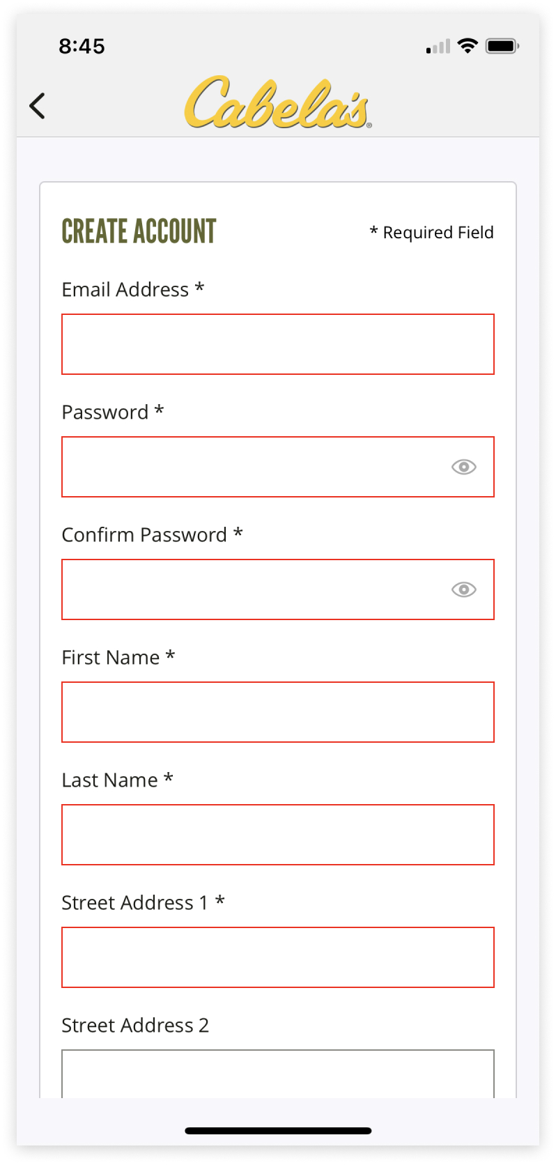
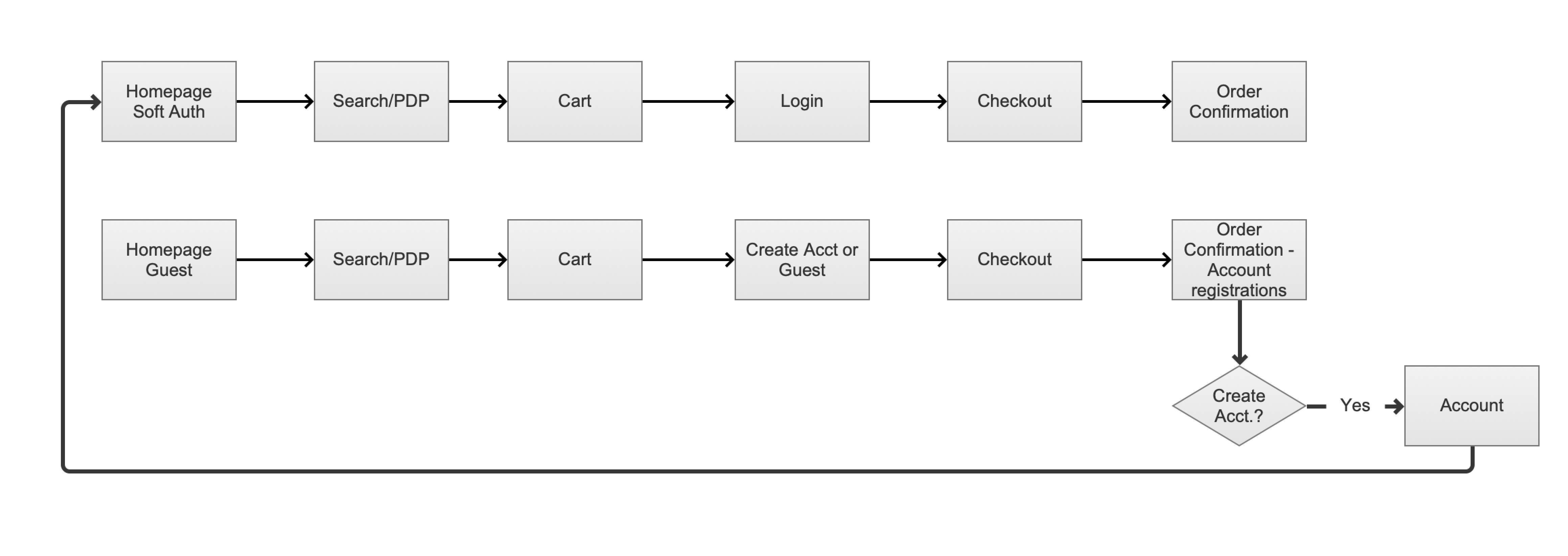
RETURNING & FIRST TIME PURCHASERS
Below represents the flow of returning users and first-time purchases and having the ability to capture them after checkout.
The research phase began with a simple competitive analysis of other apps and published articles by NNGroup.com (Norman and Nielsen) based around best practices and friction areas of the account creation process. I wanted to learn and find others in the app space to understand if Cabela’s process needed an update.
Once the preliminary research was complete, I took the findings to further define requirements and proceeded to sketch out concepts. Based on the findings above, I advocated for a flexible yet fast account creation process.
Below visualizes me working through how the interaction is going to function when a user engages with either the cancel & reschedule cta’s and where those two cta’s should live on the page and app.

This mid-to-hi-fiedelity prototype showcases what it would be like opening the app for the first time. Click on the CTA below to view the axure prototype
View Prototype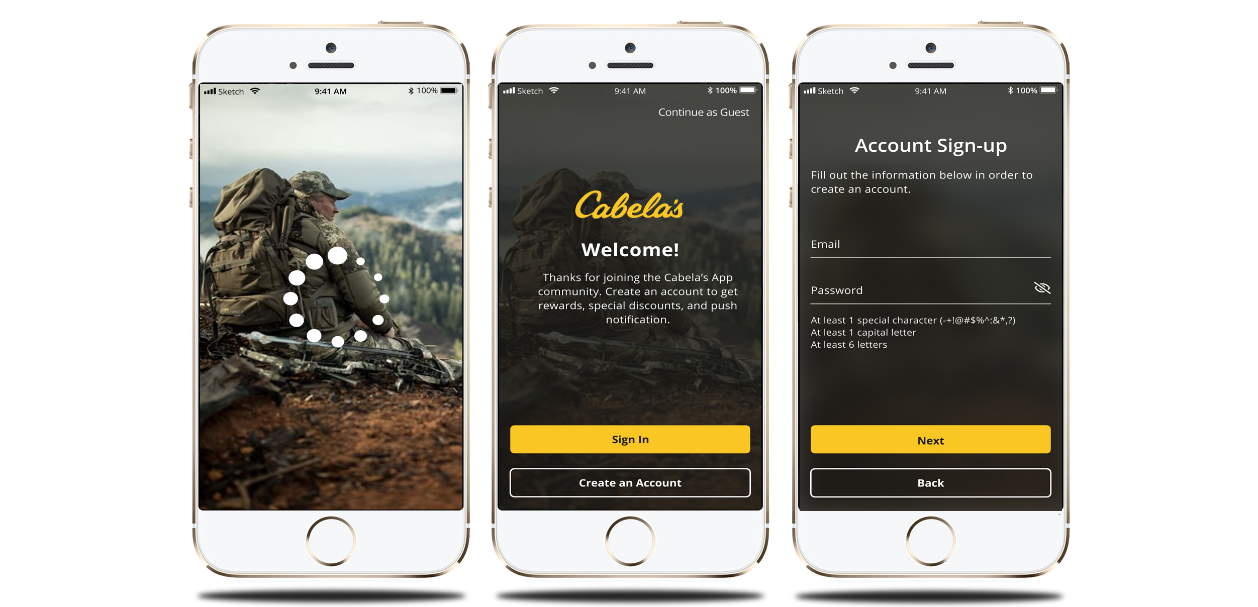
Bringing together business goals and proper UX strategy shaped the iterative MVP approach by creating a more streamlined account creation and personalized shopping experience.