Creating a more effcient single page checkout journey for users on arrow.com
Arguably, the most important aspect of any eCommerce platform is the checkout process. Creating an effective and efficient experience can either make the difference between successful product deployment or product failure. Before arrow.com’s checkout redesign, the experience was rigid, lacking in performance, and had scalability issues. The challenge was to understand any nuances in the checkout experience which would create a more efficient and desirable experience to positively affect our KPI’s with the ability to scale up traffic and features to accommodate our user’s needs.
Even though we have very unique user base, they exemplified similar tendencies and needs of a typical eCommerce user when checking out. When the paradox of choice becomes too heavy, users became confused, focused on the wrong task, and/or unsure on how to proceed further. Without personalization to provide an experience dedicated to a specific user, the paradox of choice remains in order to cater to all personas.
In the first month of the new single page checkout A/B test, the results uncovered a large performance gain based on the new architecture and API call updates, lower abandonment, and higher conversion rate due to a better more efficient user experience. Also, user testimonials gathered through Eloqua support the success of the new checkout process.
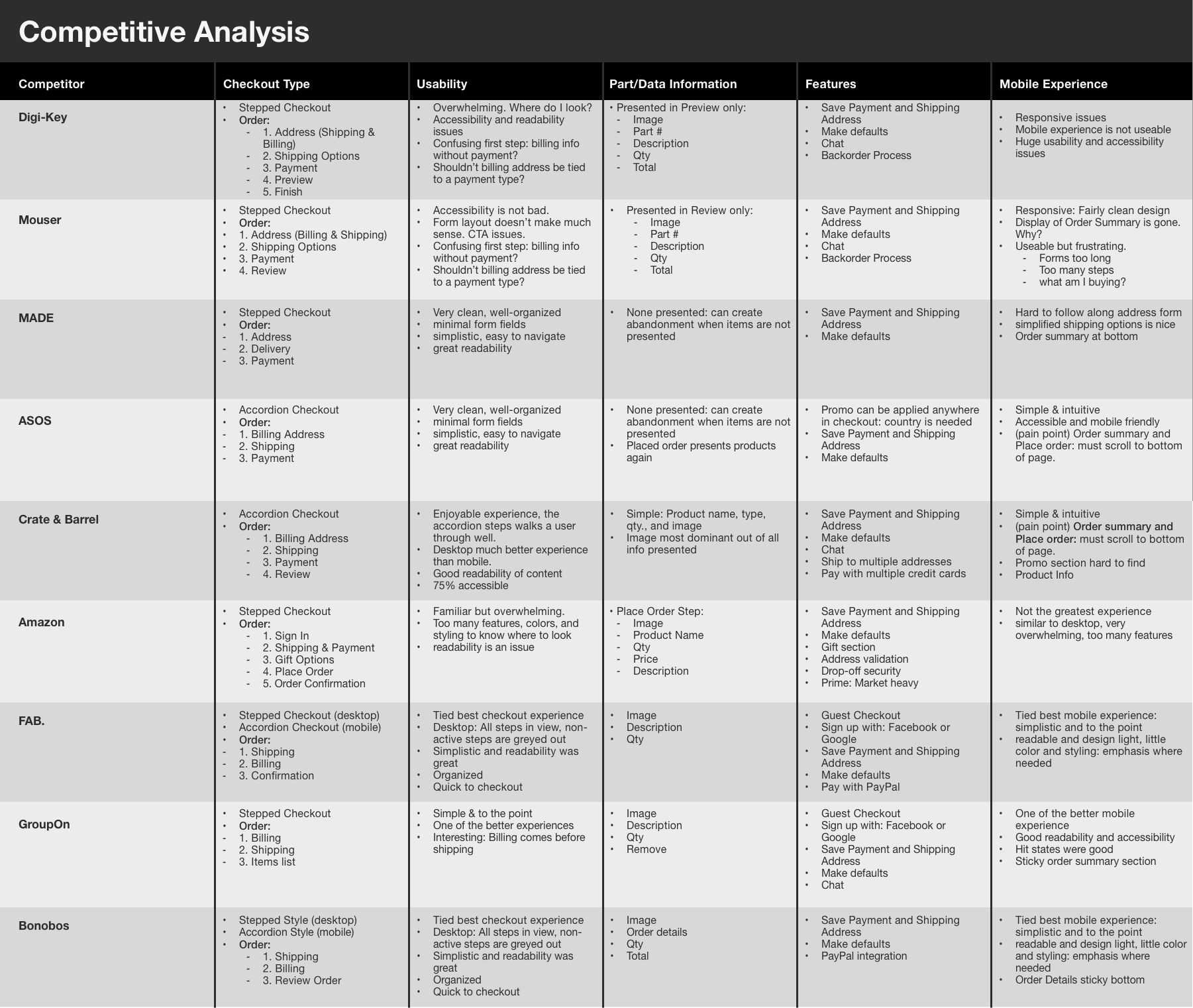
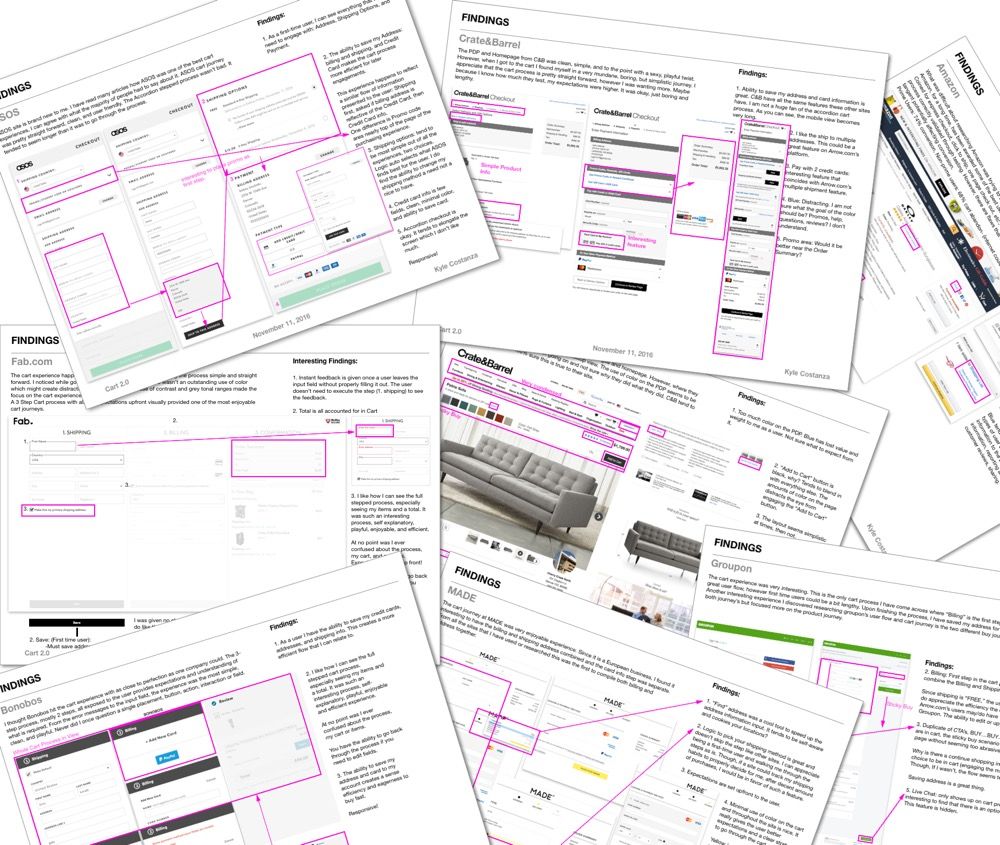
The research phase began with a competitive analysis of other eCommerce website checkout process. The eCommerce sites that were analyzed (Digi-Key, Mouser, MADE, ASOS, Crate & Barrel, Amazon, FAB., GroupOn and Bonobos ) were either stepped or accordion process. Similar in theme and content, so it was essential to understand any nuances in the user experience when going through the checkout process. After analyzing, then synthesizing the data, I had a clear idea of where I wanted to start based on previous research and understanding of our users and customers.
With the data documented and on top of mind, I was able to establish a clear checkout flow and hierarchy, which will later translate into low-fi wireframes. The findings and takeaways from the competitive analysis are as follows:
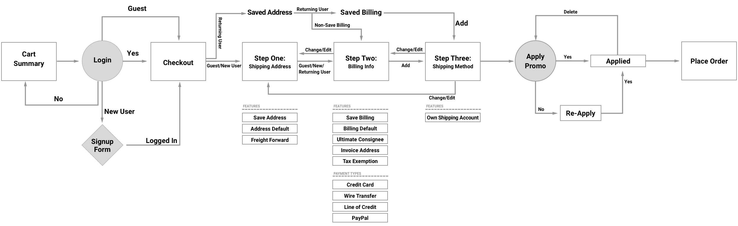
Being tasked to update arrow.com's checkout journey can be complicated from a technical standpoint and complex when trying to bring business initiatives with users’ needs and desires. As part of my process, I like to diagram the user flow (checkout) in order to drive a proper strategy and approach to achieve our goals: reduce time in checkout, lower abandonment rate and help performance. The flow is a starting off point to better understand the needs, must haves, and potential checkout order. Even though the steps may not be set in stone, the features and methods below are must have functionality.
After completing the flow, I pulled Google Analytics (GA) data to better understand the pain points, and moments of truth before I started to wireframe. I gather as much data as possible, both qualitative and quantitative, to gain the understanding and empathy necessary to creating a positive experience.
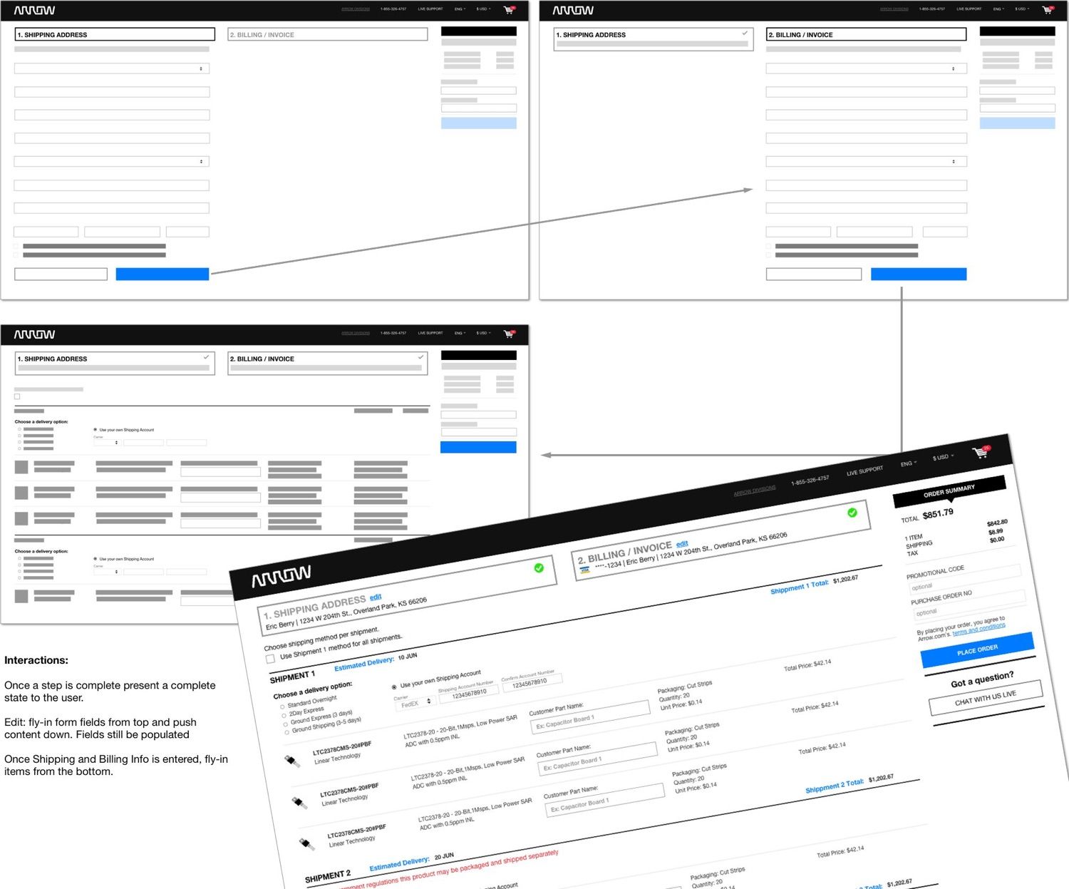
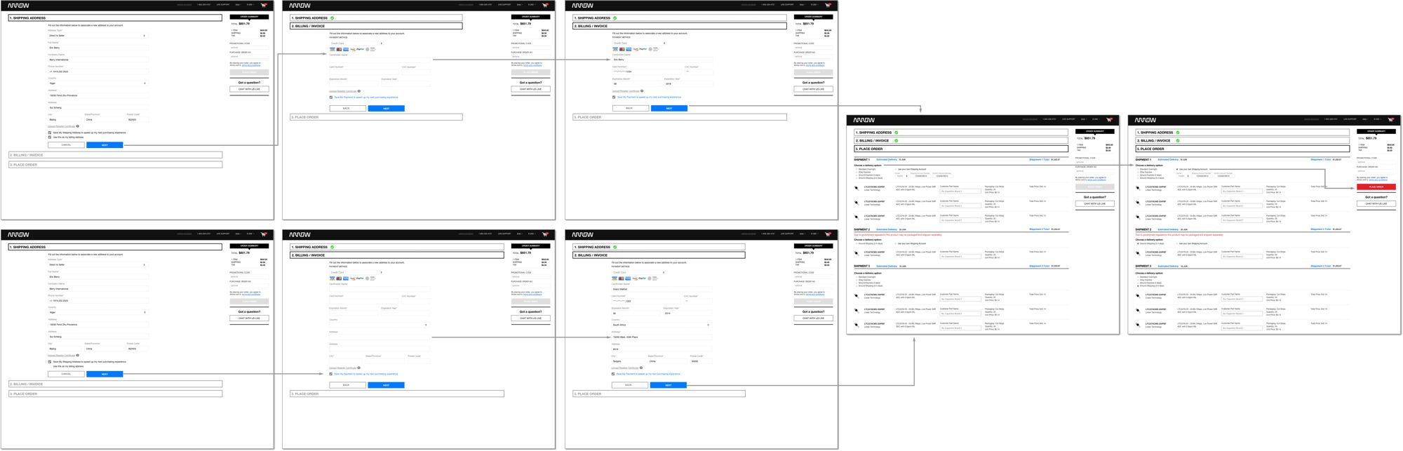
Taking the competitive analysis, flow diagram, and GA data into consideration, the next step is to put my ideas onto paper or digital wireframes. In this case, I choose to place my concepts onto the digital space because Sketch makes it so easy with nested symbols.
Once I felt good about the initial concepts, I presented my findings and concepts with internal stakeholders to convey my approach moving forward and gather feedback.
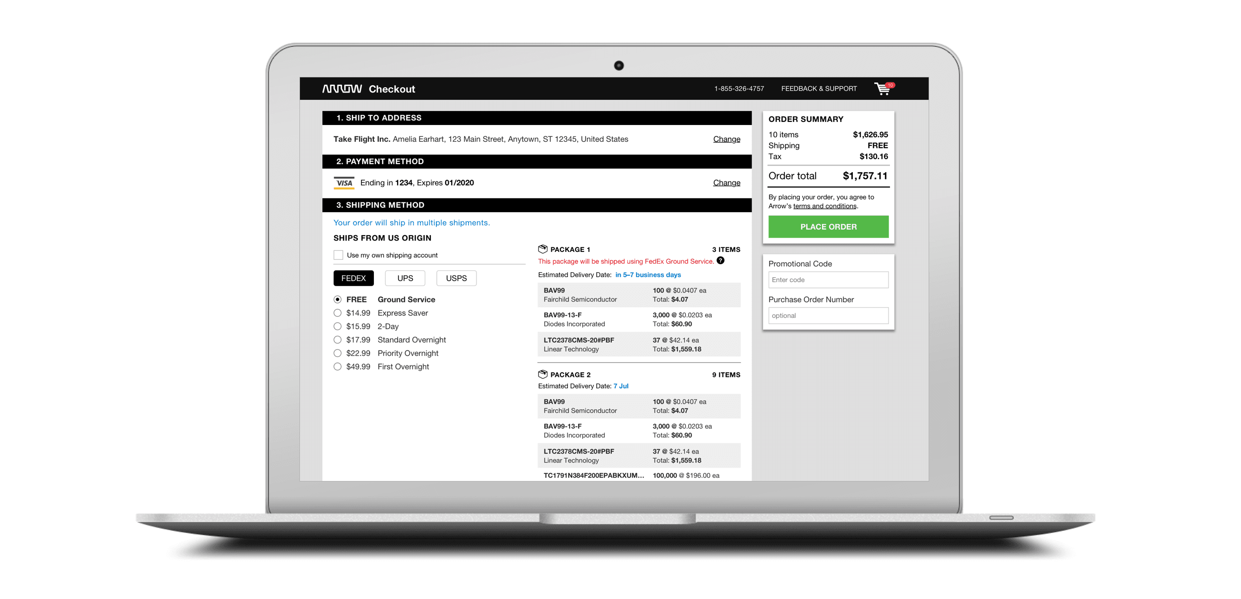
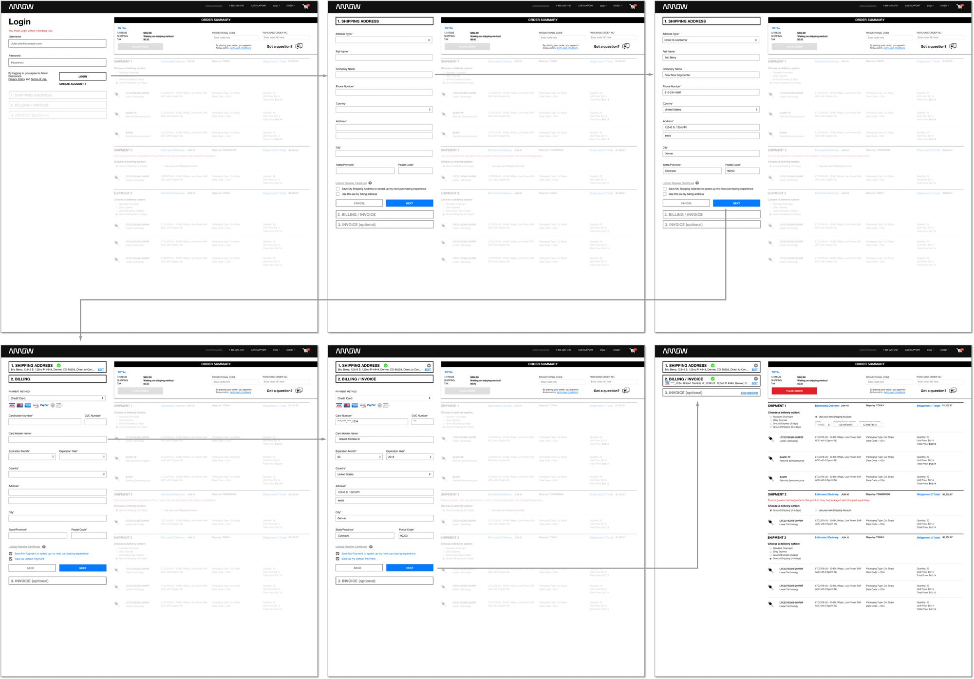
Below highlights my process of taking a low-fi to a mid-fi wireframe mock. Keeping with our design patterns and systems, I took our card concepts from MyAccount as part of the new Checkout concepts.
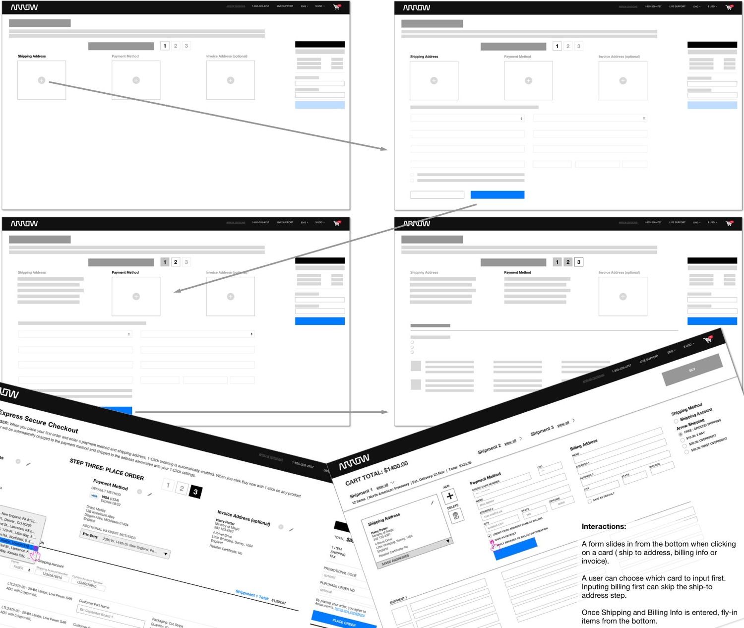
The accordion concept is derived from my competitive analysis, which, depending on the device, is a combination of a stepped and accordion process. On desktop, the user would see a stepped/accordion view, and on mobile/tablet(vertical) the user would be taking through an accordion process. It makes great use of the space while creating an effective journey for the user.
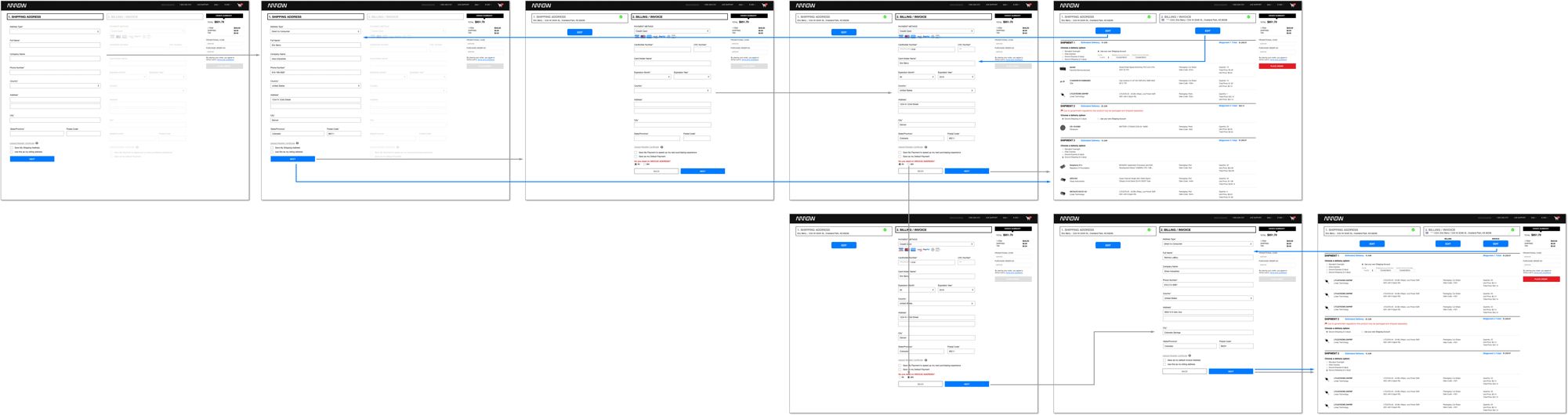
The objective is to refine the concepts in order to user testing with internal and external stakeholders.
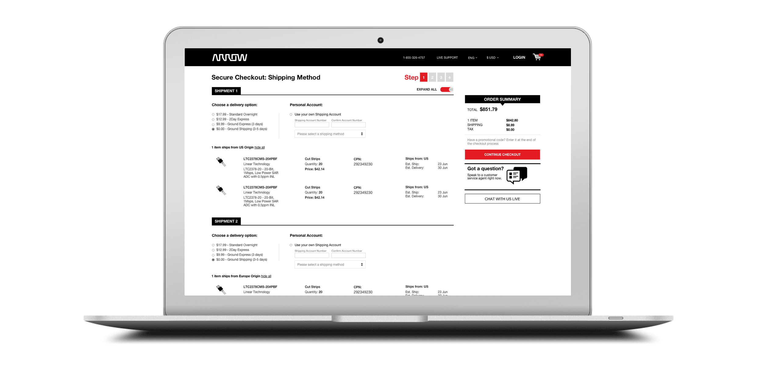
Inspired by my research, the concept pushes focus on checking out by providing expectations on what the user needs to fill out (ship to address & billing info) before seeing their itemized part list.
Typical of a stepped checkout process, it places the users focus on a single task.
The last concept brings attributes of each concepts above. I’d like to see if the user loses focus on the ordering process by exposing the parts upfront, inactive, on the first step.
I ran a user test on internal stakeholders (Engineers, PO's, CSR's & Managers), and external stakeholders through usertesting.com. Below are findings and takeaways.
Overall, testers thought the checkout process had typical functionality
80% were able to find how to return to the cart and get through checkout
Some testers are used to seeing the payment method last instead of the shipping method
A couple of testers did not know how to apply the promo code but eventually figured it out
None of the testers knew what an invoice address was
Users wanted the ability to enter a promo code before or earlier in the checkout process
When presenting parts (inactive state) on page load, it casued the users to focus on what they were purchaing instead of checking out.