Problem
Currently, the exposure of HomeAdvisor's fixed price tasks are limited to our service request path and marketing hooks. With little presence, this makes it difficult for users to discover our array of fixed price tasks on HomeAdvisor and learn about the process.
Goal
Create a new marketplace, independent of HomeAdvisor’s quote-based model, designed to increase visibility for fixed-price tasks and promote the new business model.
- DELIVERABLE
- Competitive Analysis, Sketching, Wireframes, Protoype & Final Designs
- ROLE
- User Experience Designer
- TOOLS & SOFTWARE
- Axure & Adobe Analytics
Challenge
The challenge was to bring a new business model into the fold, fixed price services, without cannibalizing our main source of revenue. Traditionally, homeowners’ access the HomeAdvisor platform to submit a service request free of charge. This request is sent out to 3 or 4 pros in the form of a lead, which is then monetized by HomeAdvisor. Will homeowners be open to purchasing fixed price services on HomeAdvisor?
Research
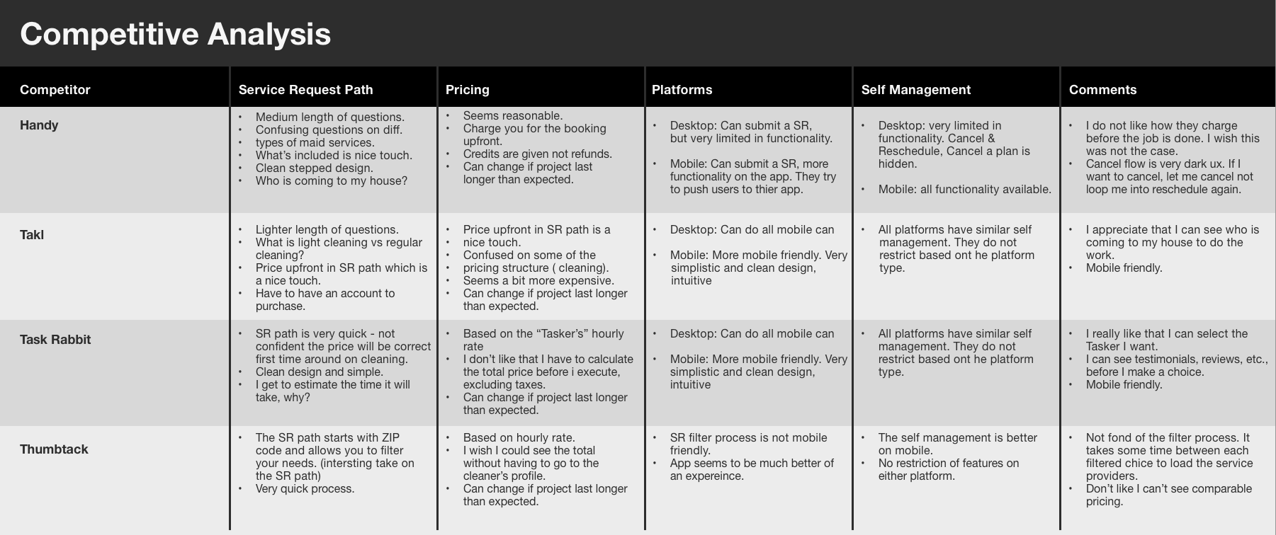
Competitive Analysis
Competitive Analysis
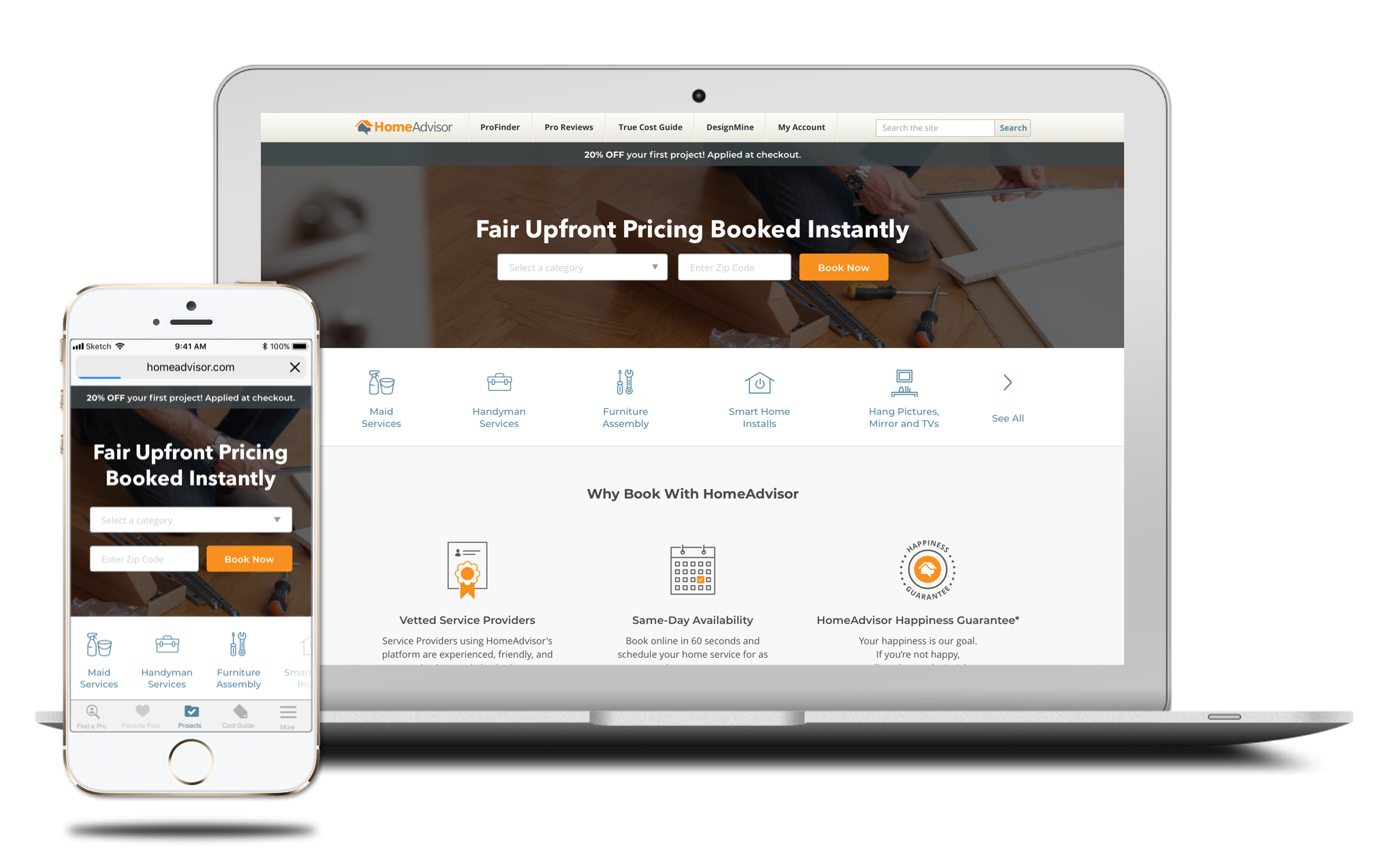
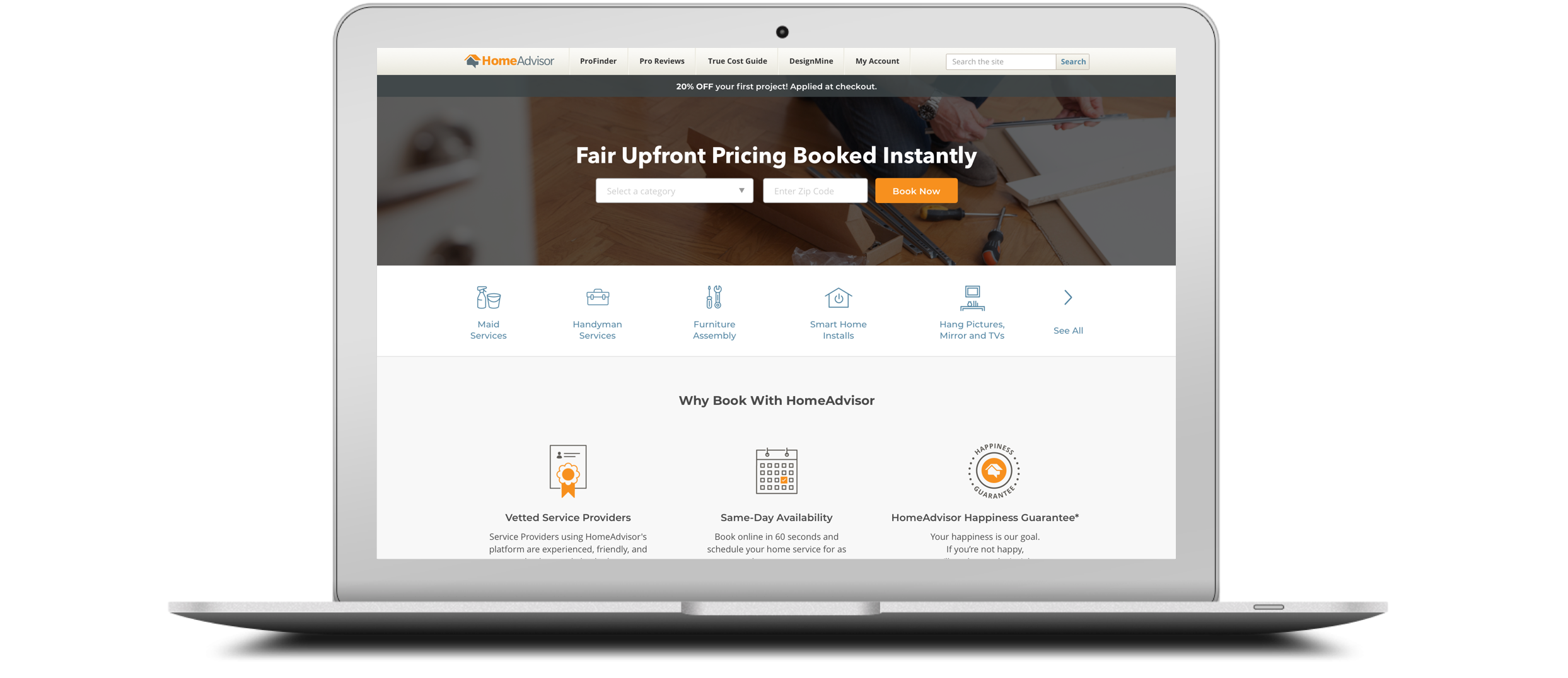
The research phase began with a competitive analysis of other Gig Economy tasks. The Gig Economy sites that were analyzed (Handy, Takl, Thumbtack & Task Rabbit ) were all similar in theme and content, so it was essential to understand any differences in user experience when purchasing a cleaning service. Analyzing, then synthesizing the data helped me understand the ideal approach that HomeAdvisor should work towards when allowing users to book and manage a project on either the app or desktop & mobile web.
With the requirements defined, I was able to establish a clear ux flow for web, mobile web and app. The analysis led me to conclude the following:
- MOST IMPORTANT INFORMATION
- Be clear and concise with what you want your users to understand or do
Allow flexibility and self-management on all platforms
Do not restrict certain functionality based on platform
Always design in a mobile first approach
Provide honest and conside dialog
Design Process
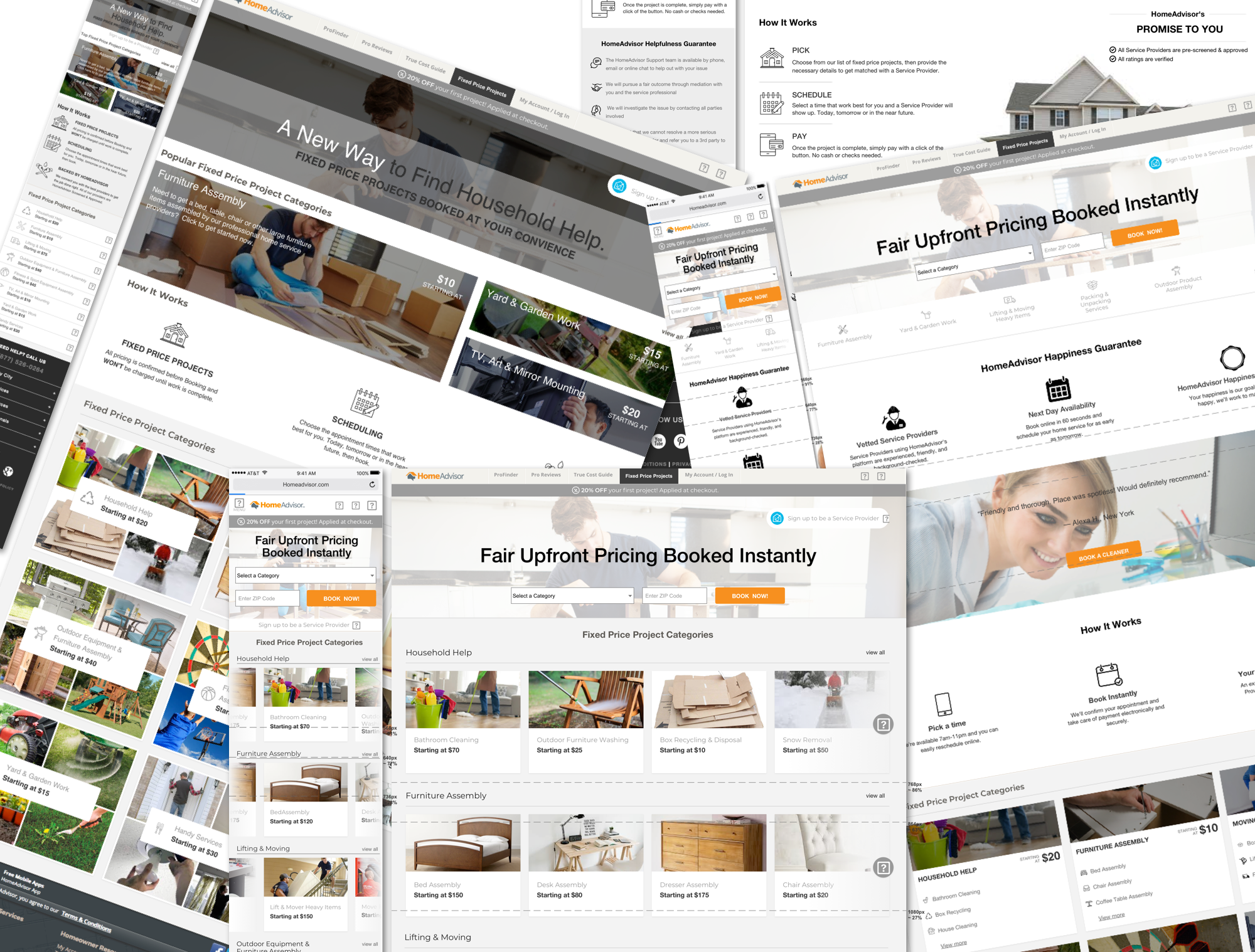
Sketching & Wireframes
Sketching & Wireframes
With the preliminary research complete, I took the findings to help bring clarity to some of the requirements. Once complete, I then proceeded to sketch out concepts. I enjoy this particular step in the design process because it allows me to work through complex journeys & experiences by putting down ideas rapidly, document questions & experiences I need to get feedback on, and drive a baseline experience from the user’s vantage point in order to user test.
The images below (sketching to mid-fi designs) visualizes me working through the complexities of an online market place: how to organize the content & data, what is the least amount of information needed in order for users to purchase, what needs to be above the fold, the flow of the page, etc.

Research
User Research
User Feedback
Gathering qualitative feedback to validate the needs of the user, pain points, and desirability of the new business model .
- TAKEAWAYS
- Test the waters with a smaller consideration task before moving to a larger task
Who is coming to my house?
50/50 on nextflix style vs card style
How do I see who is coming to my house to clean? I have kids and a family and safety is my biggest concern.
User Testing
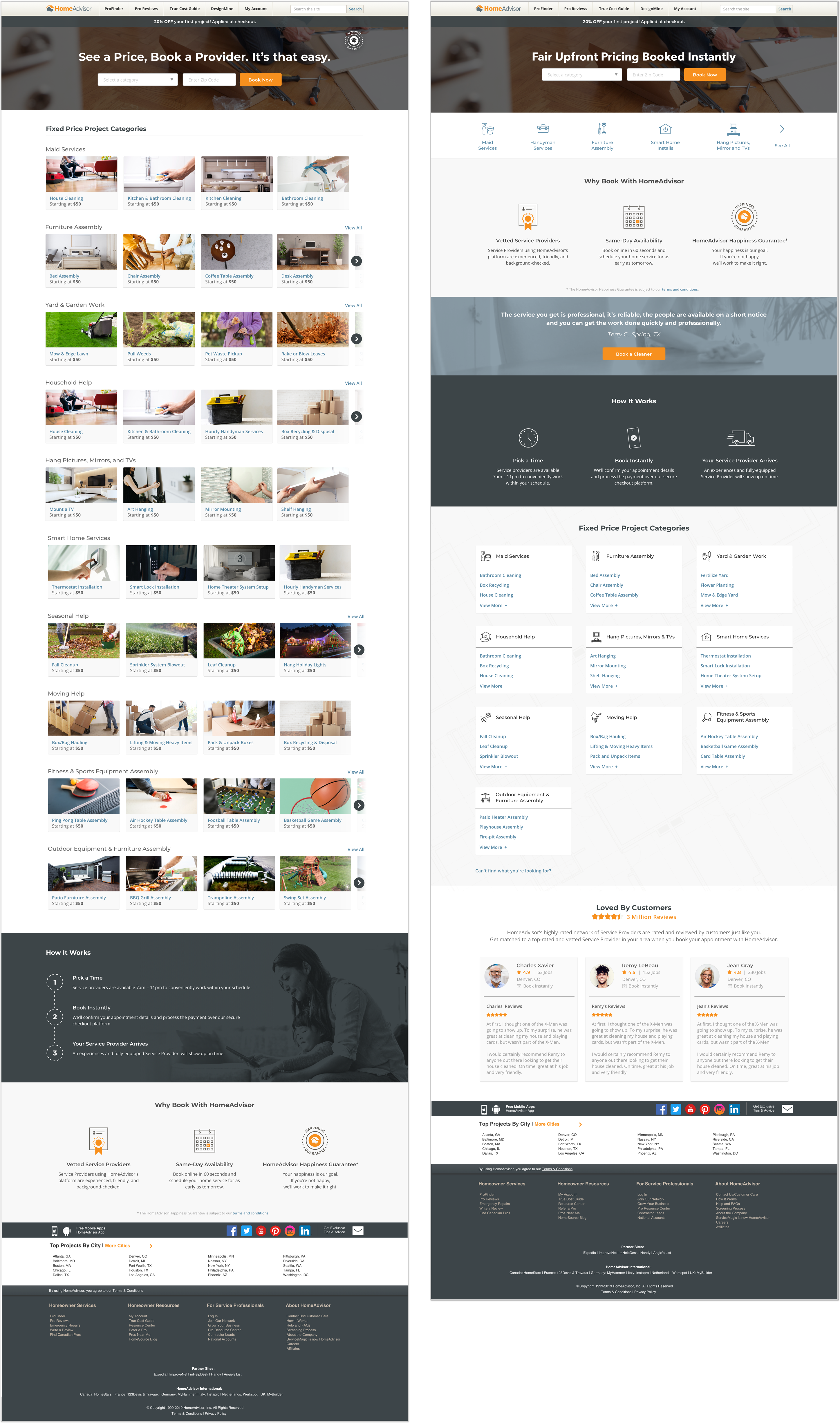
The goal of the test was to gather feedback on the variable differences between the two concepts in order to properly provide the optimal experience for our user base. Such differences as: card browse journey vs Netflix carousel journey, location of the “how it works” and “why book with HomeAdvisor modules,” visibility of pricing, & project imagery vs icon layout.
The images below are the final two designs that were approved by product to be tested. I worked with our in-house researcher to gather qualitative feedback on the variable differences in order to provide the best possible MVP approach for our user base.
- FINDINGS
- Informational sections welcomed a higher chance to purchase
Users were split on Netflix vs Card experience
Imagery on the cards helps to inform the user on the task, but also distracts and hurts readability
Users want to know who is coming to thier home
Users wanted to know if they could pick the person/company to fulfill the task
The commonly repeated talking point was around testing the waters on a smaller task before investing in medium-to-high consideration tasks.
Solution
High Fiedelity Designs
Solution
Final Designs
Solution
Bringing together business goals and proper UX strategy through an iterative approach resulted in an ideal fixed price market place based on our users' needs and desires.