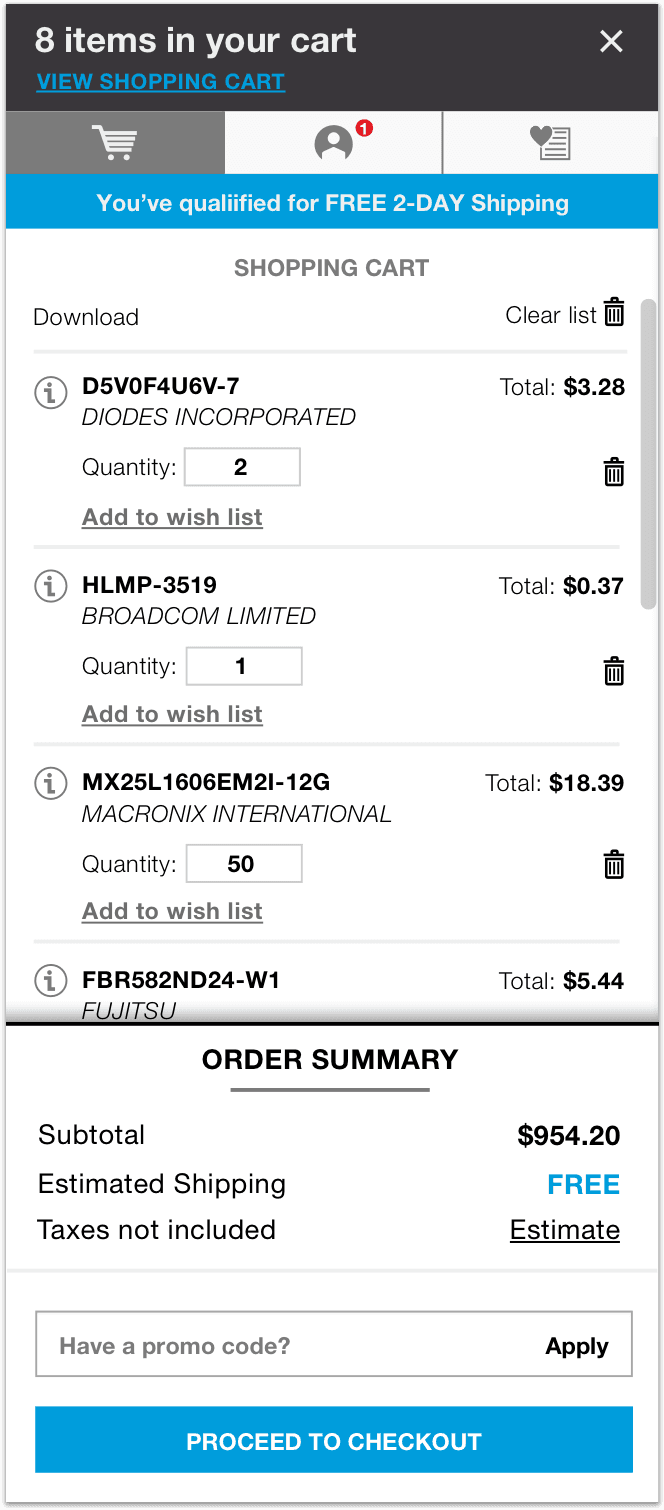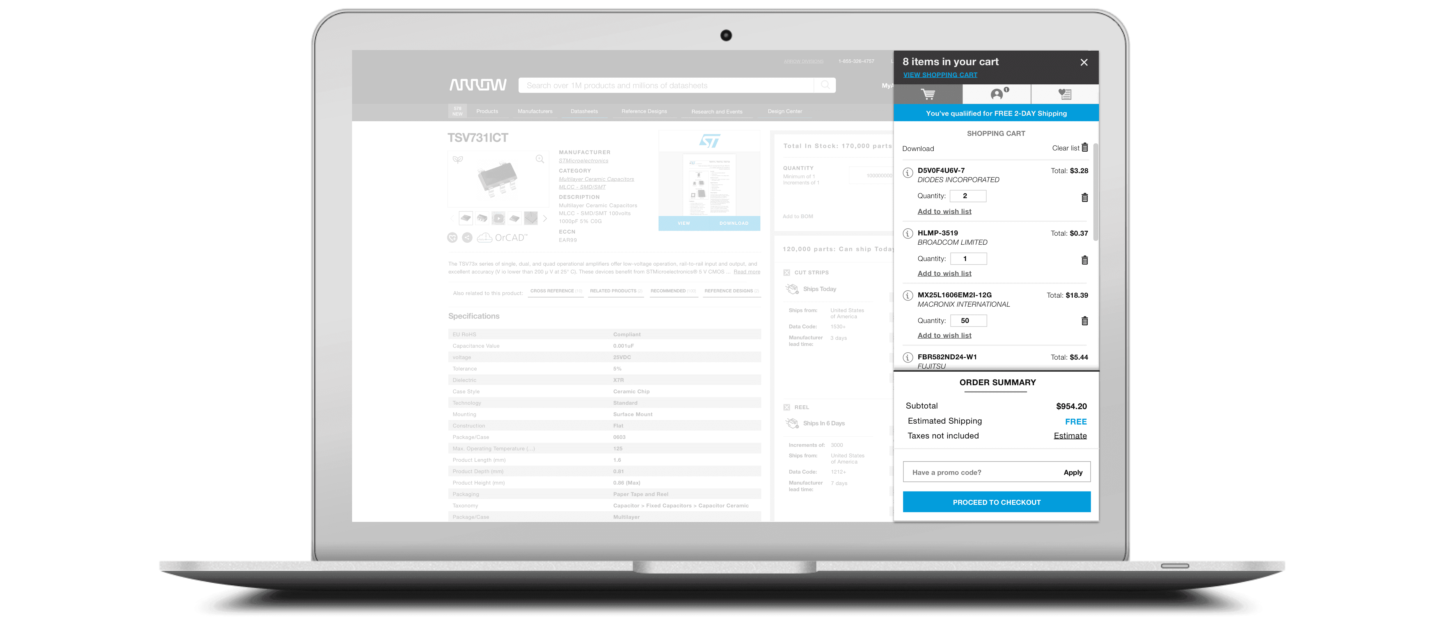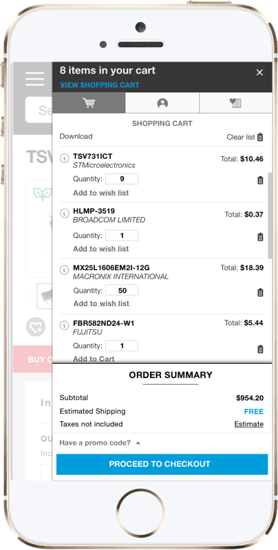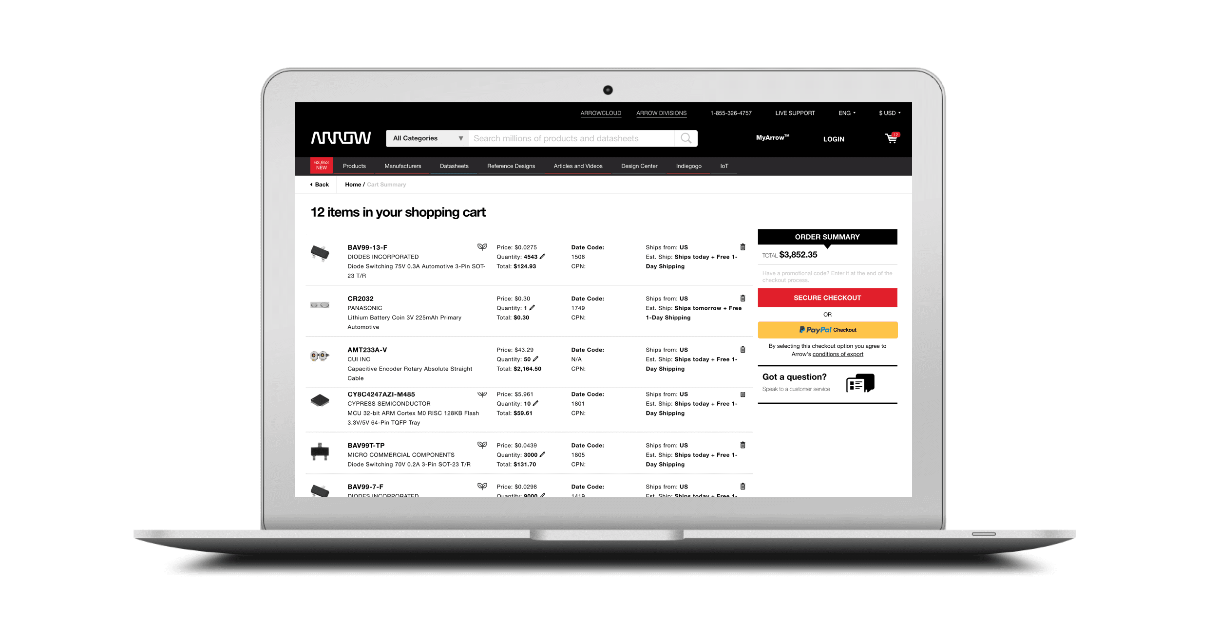
Creating a more efficient path for users to purchase, manipulate their order, and get to a closer final total on arrow.com
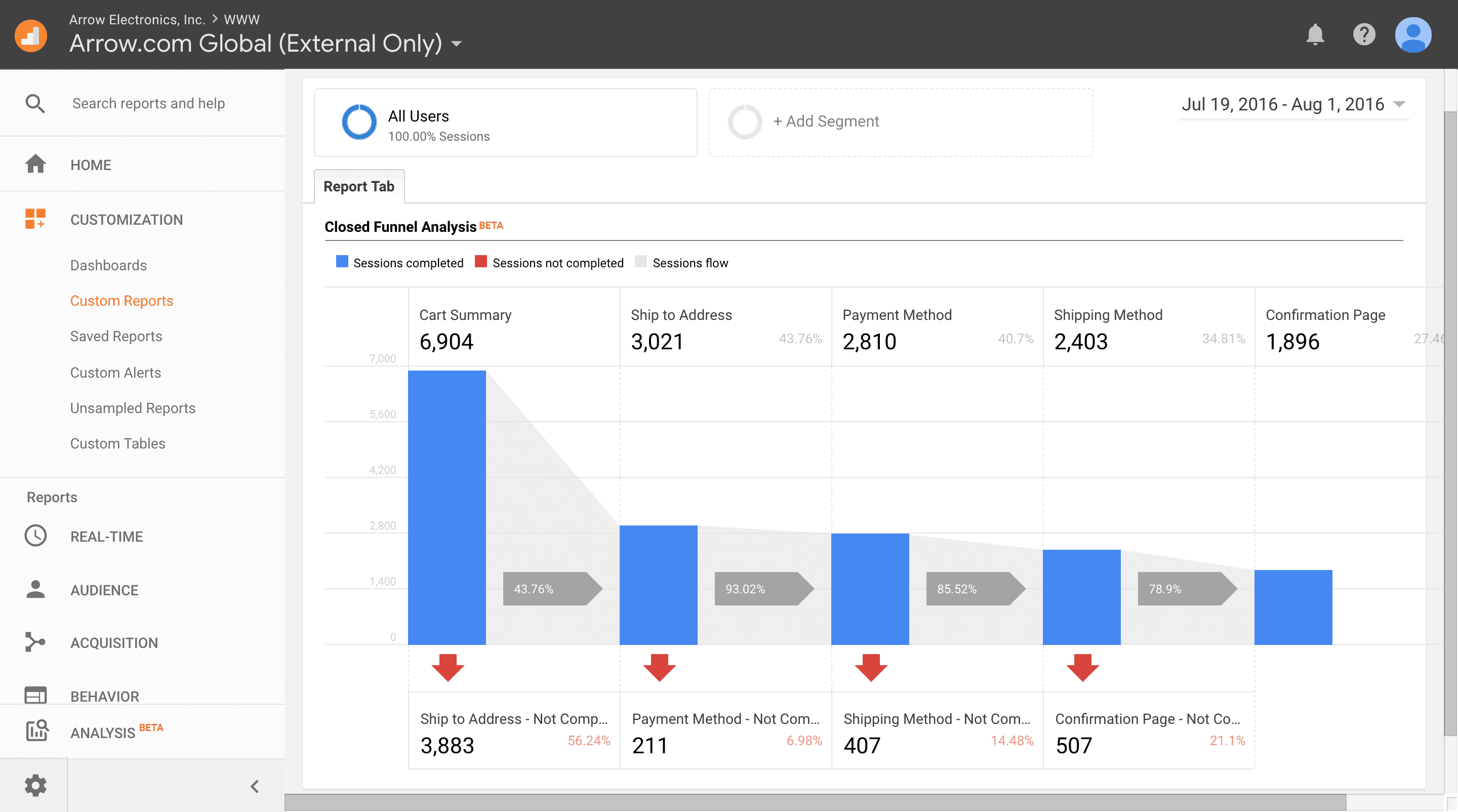
The challenge was to find and create a solution to users’ behavioral tendencies to abandon checkout in the last step. What is/are the reason(s) for this issue? Have we missed a curial piece to the users’ journey when we developed Single Page Checkout? Having the GA in hand only speaks to the “what is” and not the “why,” so I challenged myself to dive further into what our users were missing through interviews and surveys, but also understanding other potential business initiatives that may affect their journey through checkout.
Counter-intuitive to normal checkout behavior, a new subset of our personas was born. From small start-ups to large companies, the needs, expectations and approach of each individual contributor varies from company to company based on their role. What I found most interesting and potentially the biggest causation of abandonment in checkout was due to the engineers or buyers needing approval to purchase by their manager or even going as far to sending their account credentials so their managers could purchase on the company’s behalf. On arrow.com, the last step in checkout is where the user can see the final total to pass along to their managers, thus creating that abandonment. Upon further investigation and reaching out to other teams, I found certain abandonment fluctuations were caused by promotional code issues.
Bringing together qualitative feedback and quantitative data to validate a user tendency to abandon checkout after seeing a final total.
Provide final total and timelines to manager who purchases
After applying promo, opportunity to purchase more
Comparing pricing and delivery timelines with competitors

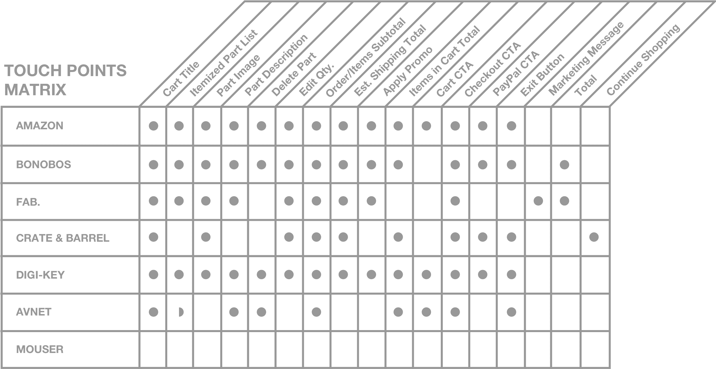
The research phase began with a market analysis of other eCommerce fly-in cart features. The eCommerce sites that were analyzed (Digi-Key, Mouser, Avnet, Amazon, Crate & Barrel, Fab, and Bonobos) consisted of a range of content, interactions, features and ui. I typically like to get a variety of direct and non-direct competitors to baseline what potential market expectations are.
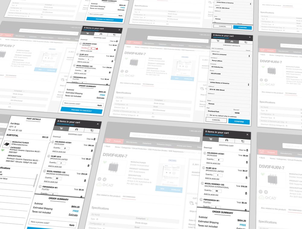
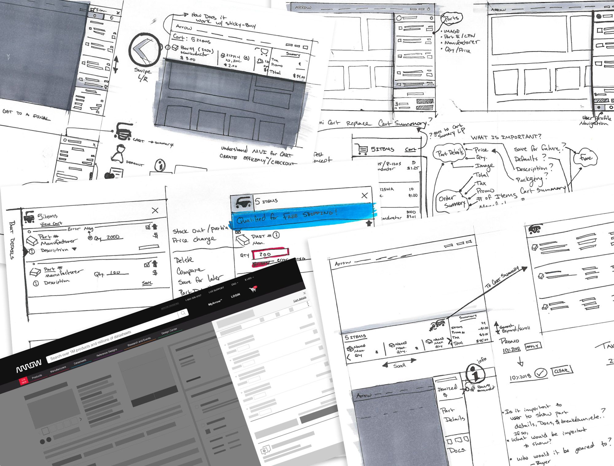
With the preliminary research complete, I took the findings to help define requirements then proceeded to sketch out concepts. I enjoy this particular step in the design process because it allows me to work through complex journeys and experiences by putting down ideas rapidly, and document questions and experiences I need to get feedback on.
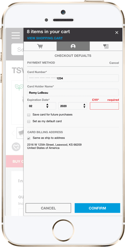
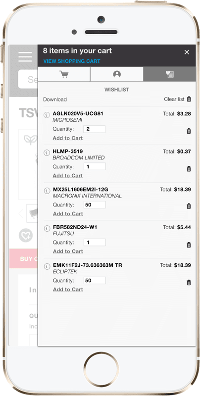
Below visualizes me working through how to organize the part info, what is the least amount of information needed in the journey to proceed to checkout, does the user need to see all the part details like on Search or PDP, how will the user input a promo code, does the user want the ability to see their checkout settings, would a user like a Wishlist feature?
The preliminary sketching & wireframing helped drive the baseline experience and expectations from the user’s vantage point. They provided insights into in the next design iterations, which would be tested on internal and external stakeholders.
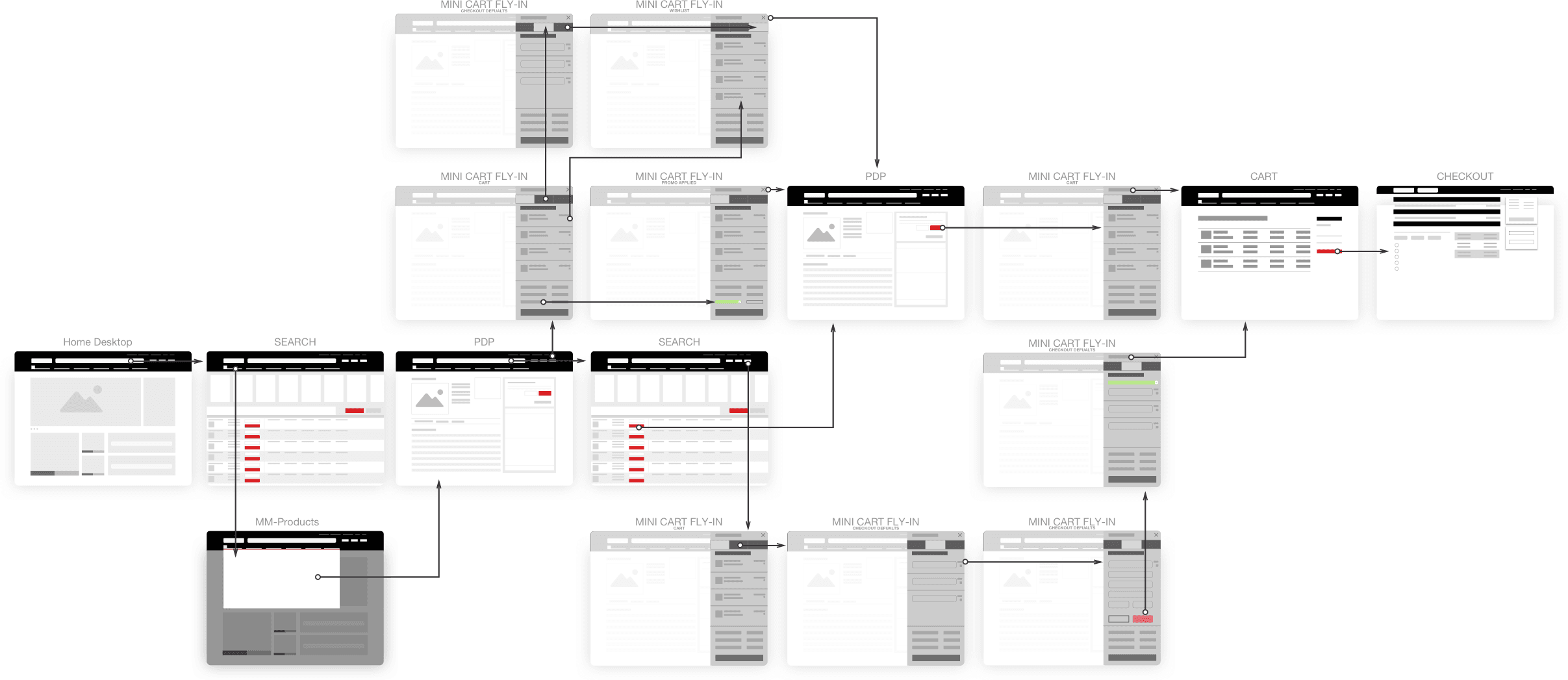
Below is an example of a high-level journey a user would interact with the minicart fly-in feature. It highlights the potential touchpoints, use cases, and moments of truth from the user’s perspective.
Working together with various stake holders throughout the design process created an understanding of knowledge and paths forward to implement the minicart fly-in feature by bringing together business goals and proper UX strategy through a lean Agile approach.
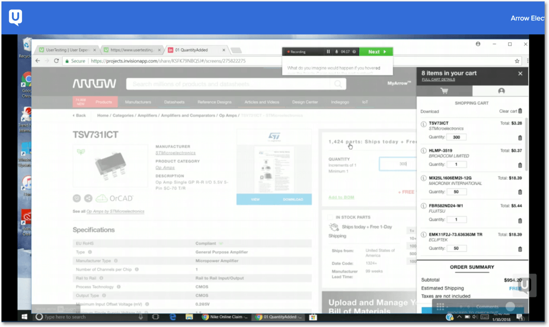
For larger features like the minicart fly-in, I tend to do several design and testing iterations in order to fully flush out needs and desires being met, sound interactions that lead users to successful journeys, proper organization and hierarchy of content, and an optimized user experience.