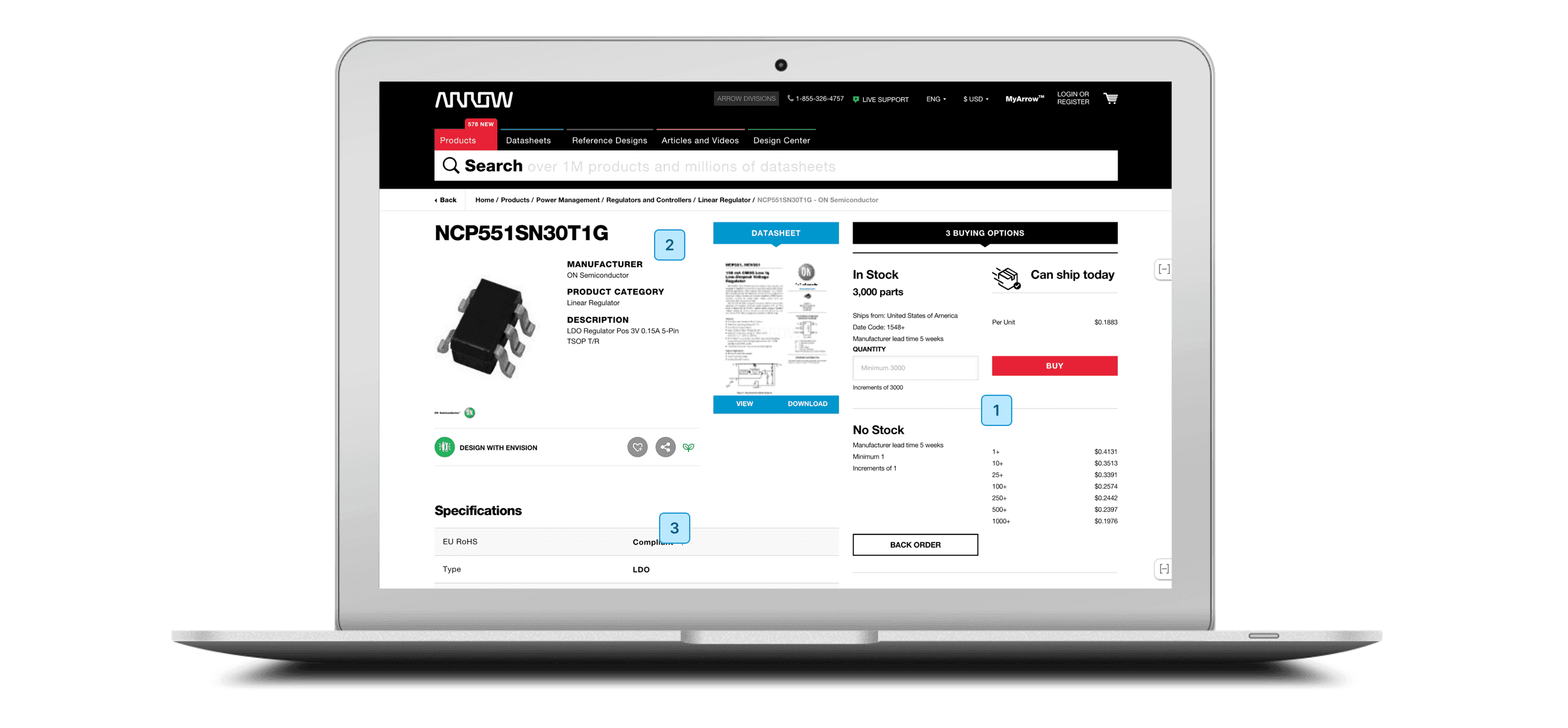
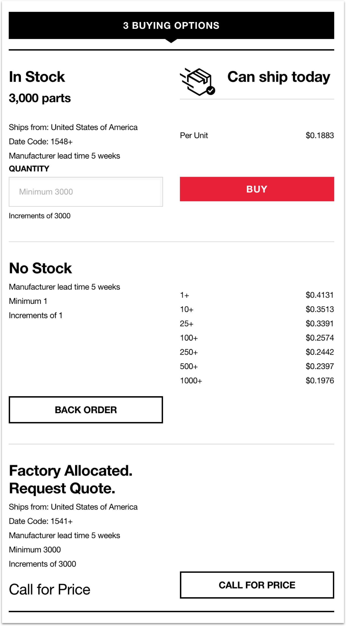
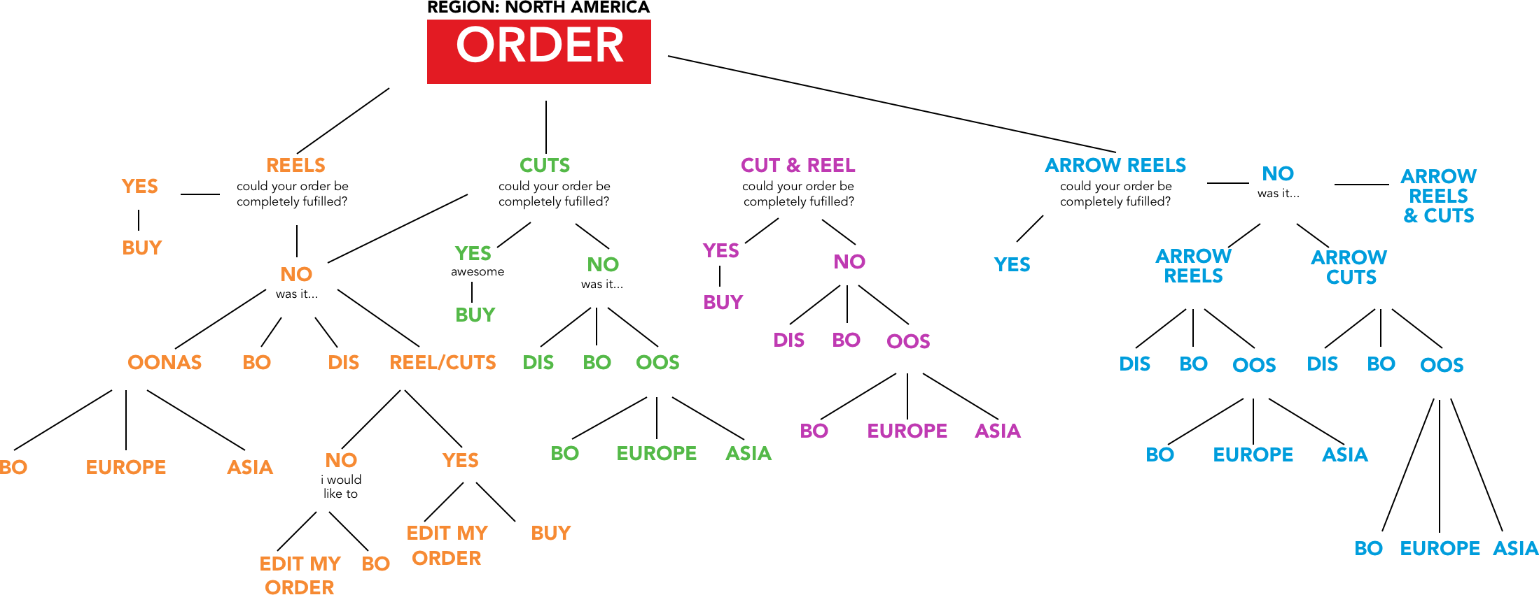
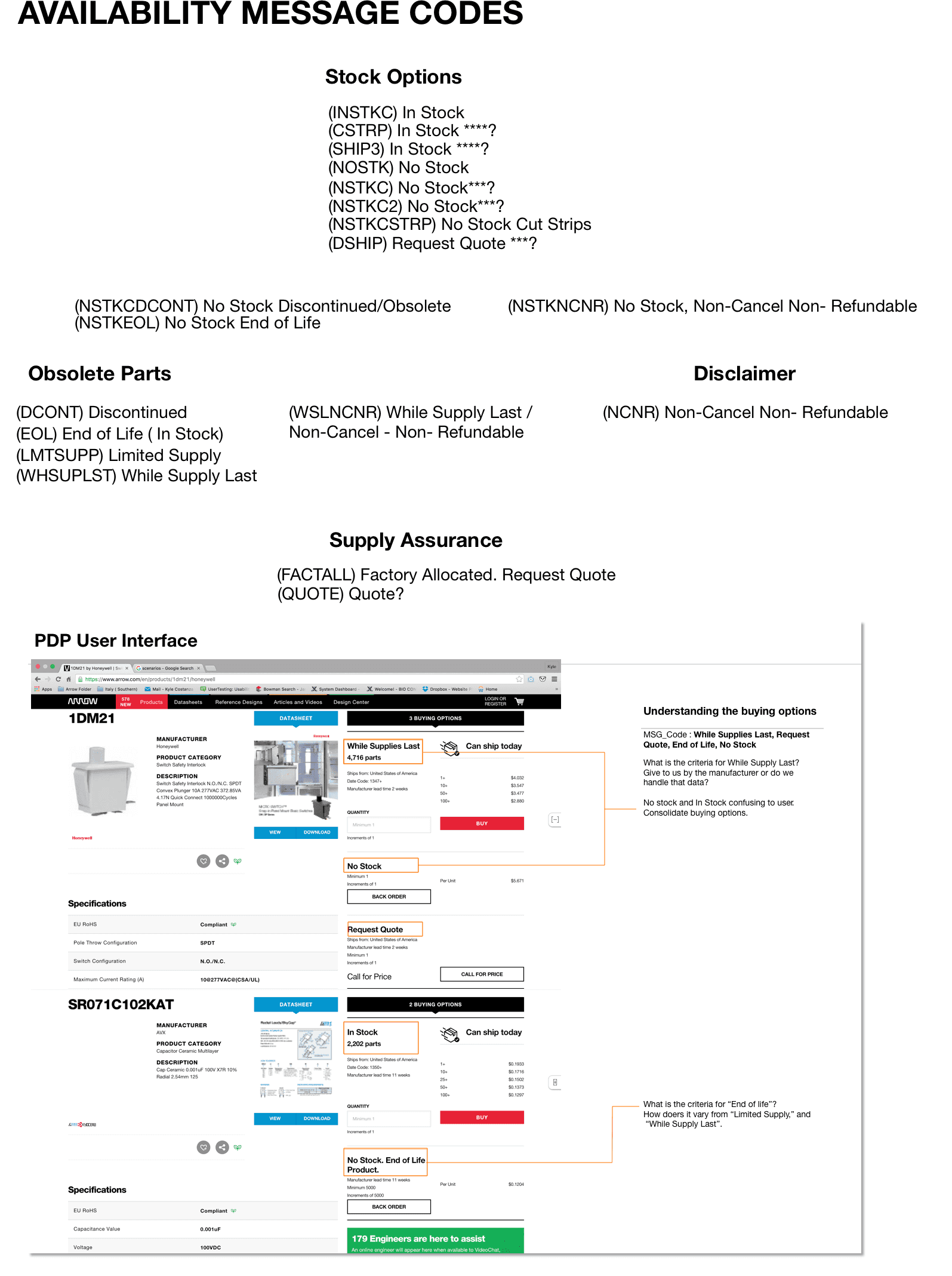
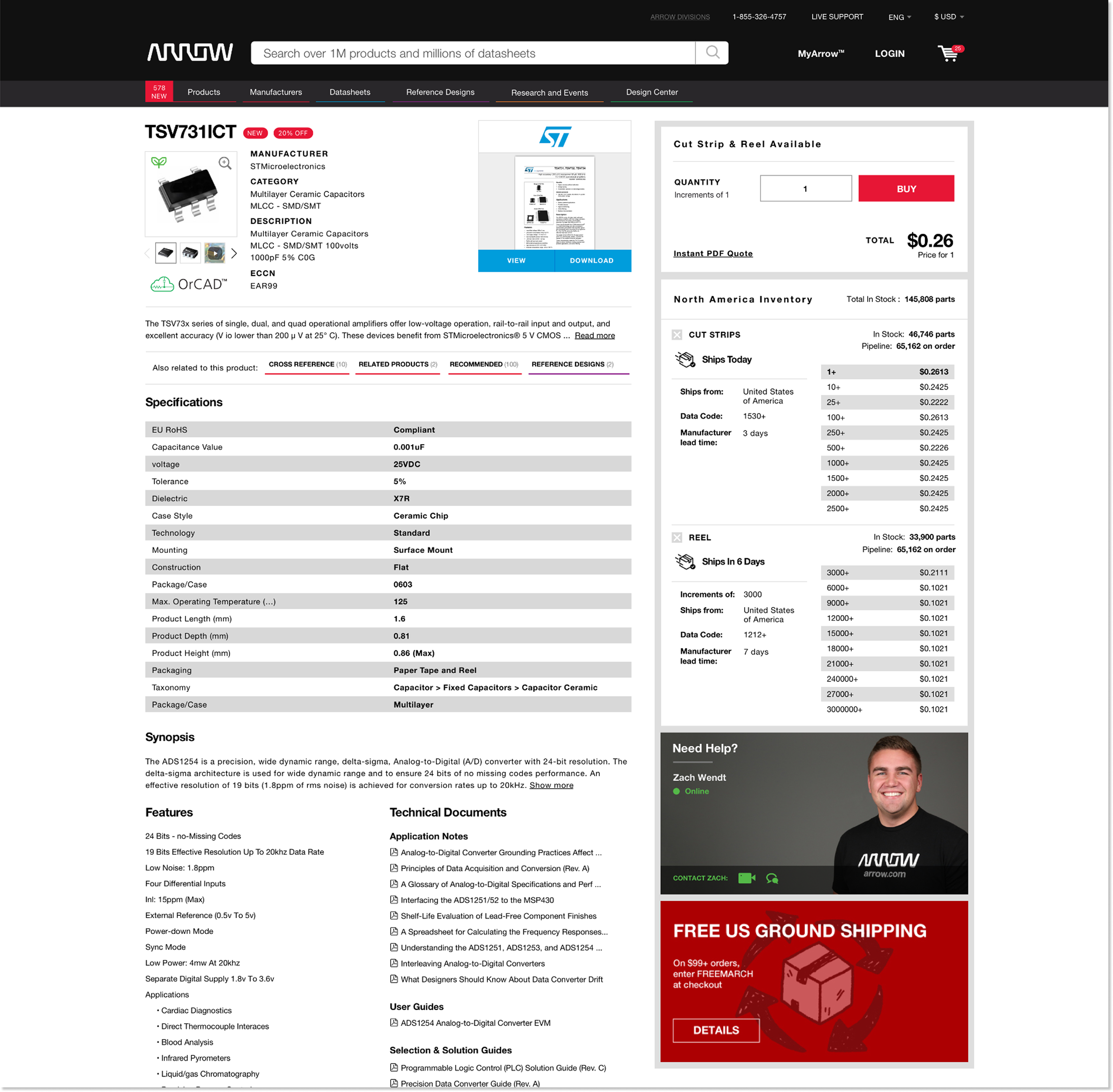
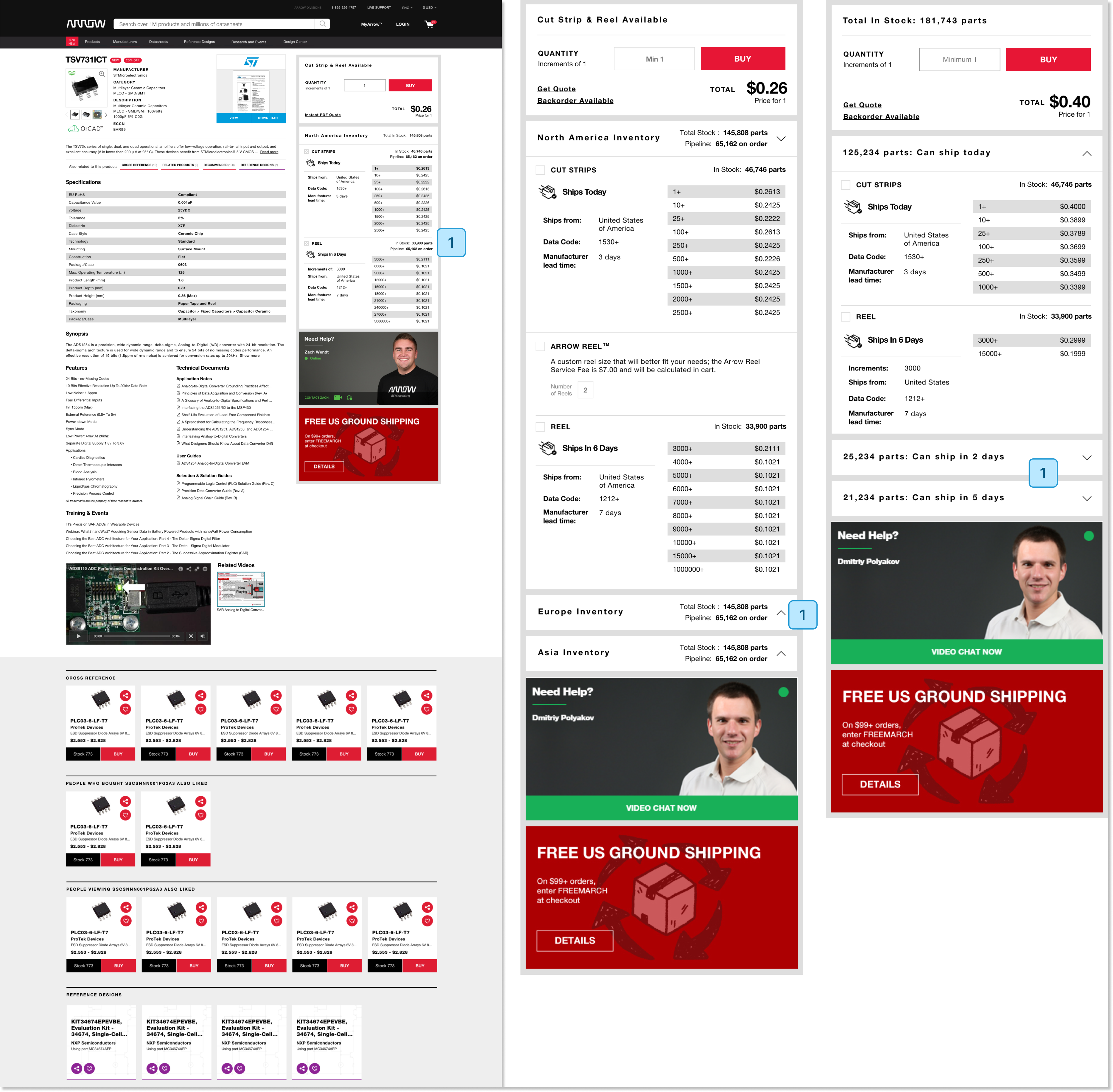
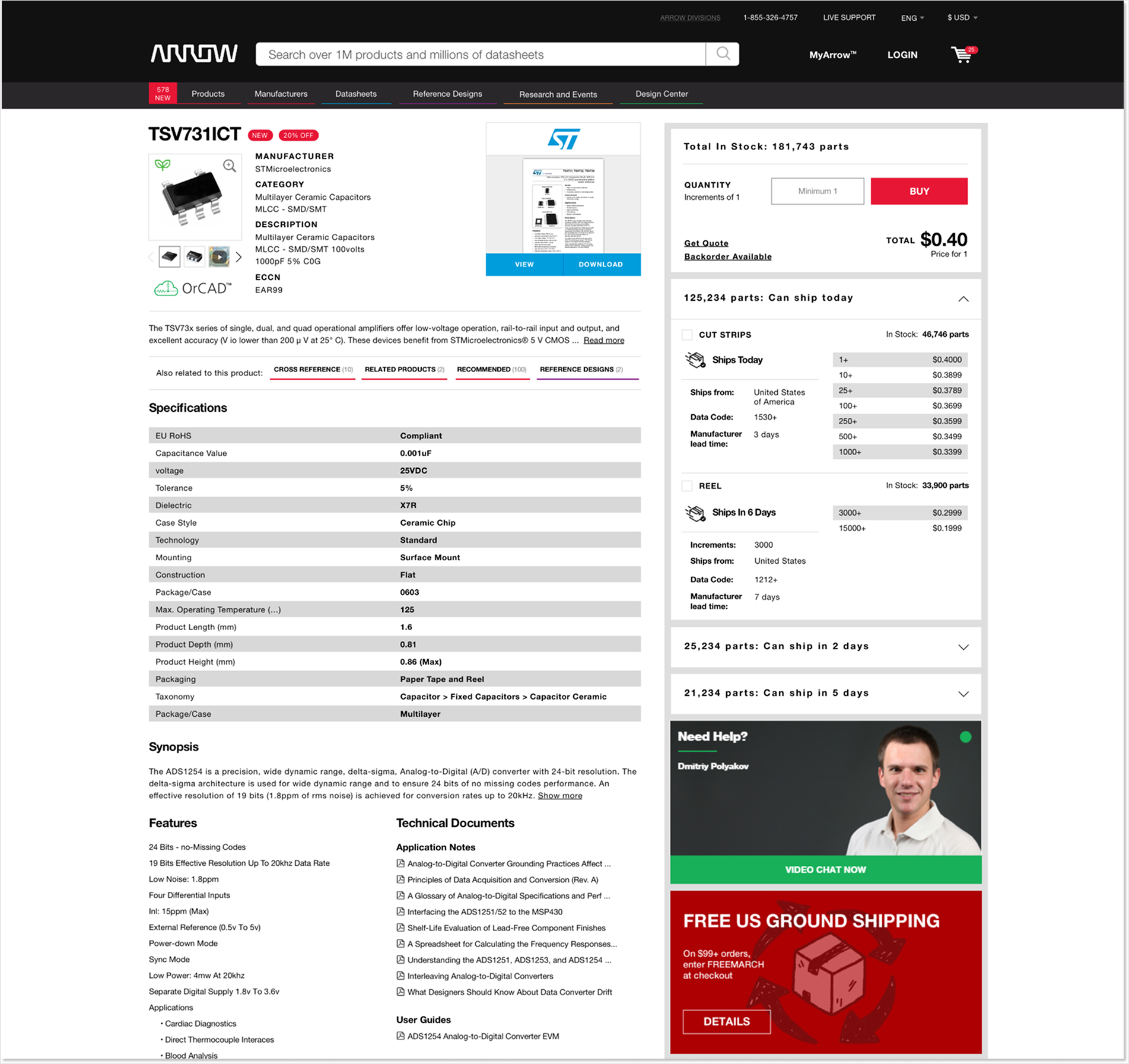
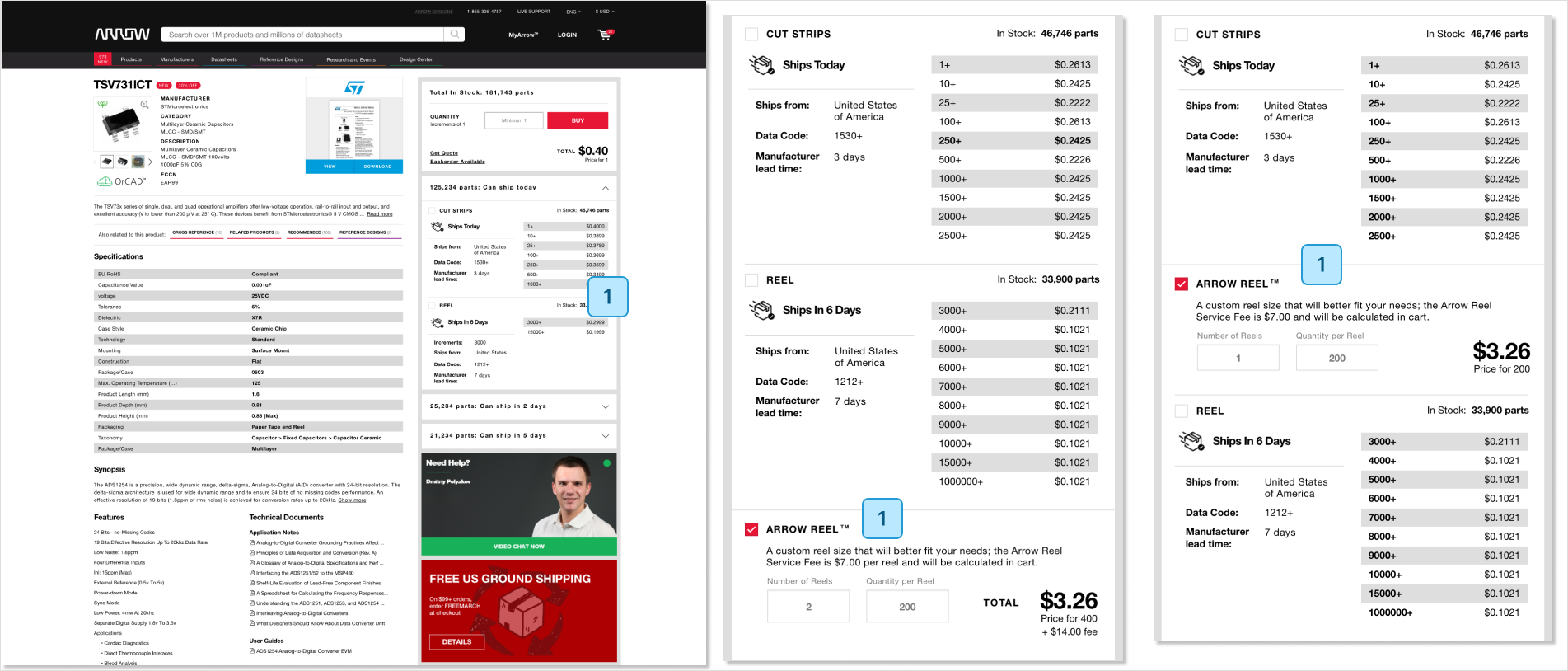
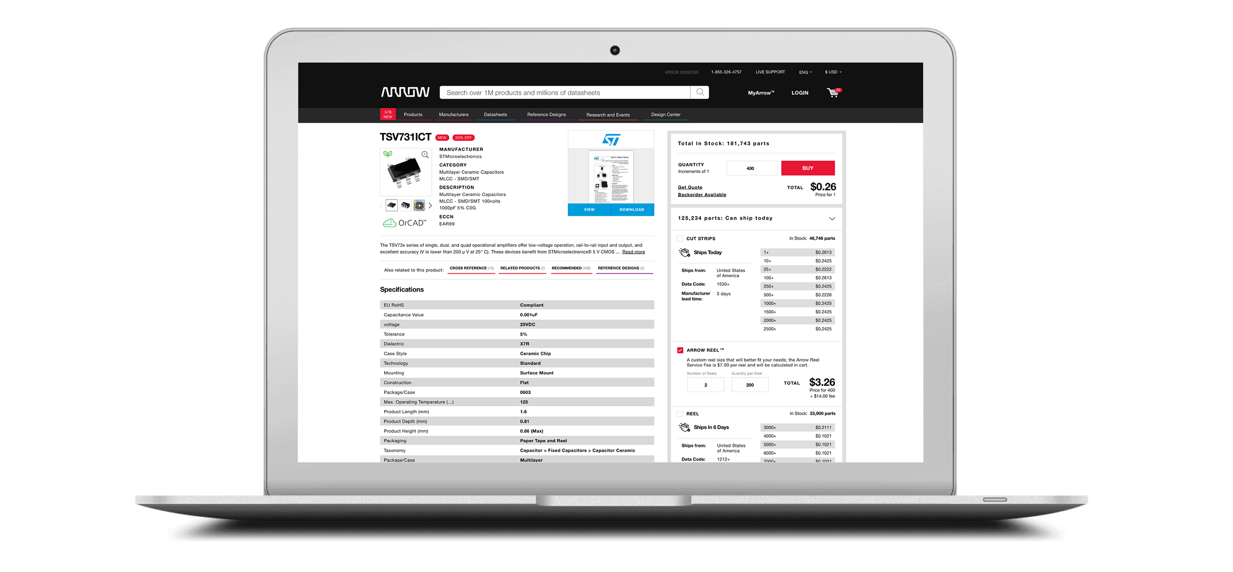
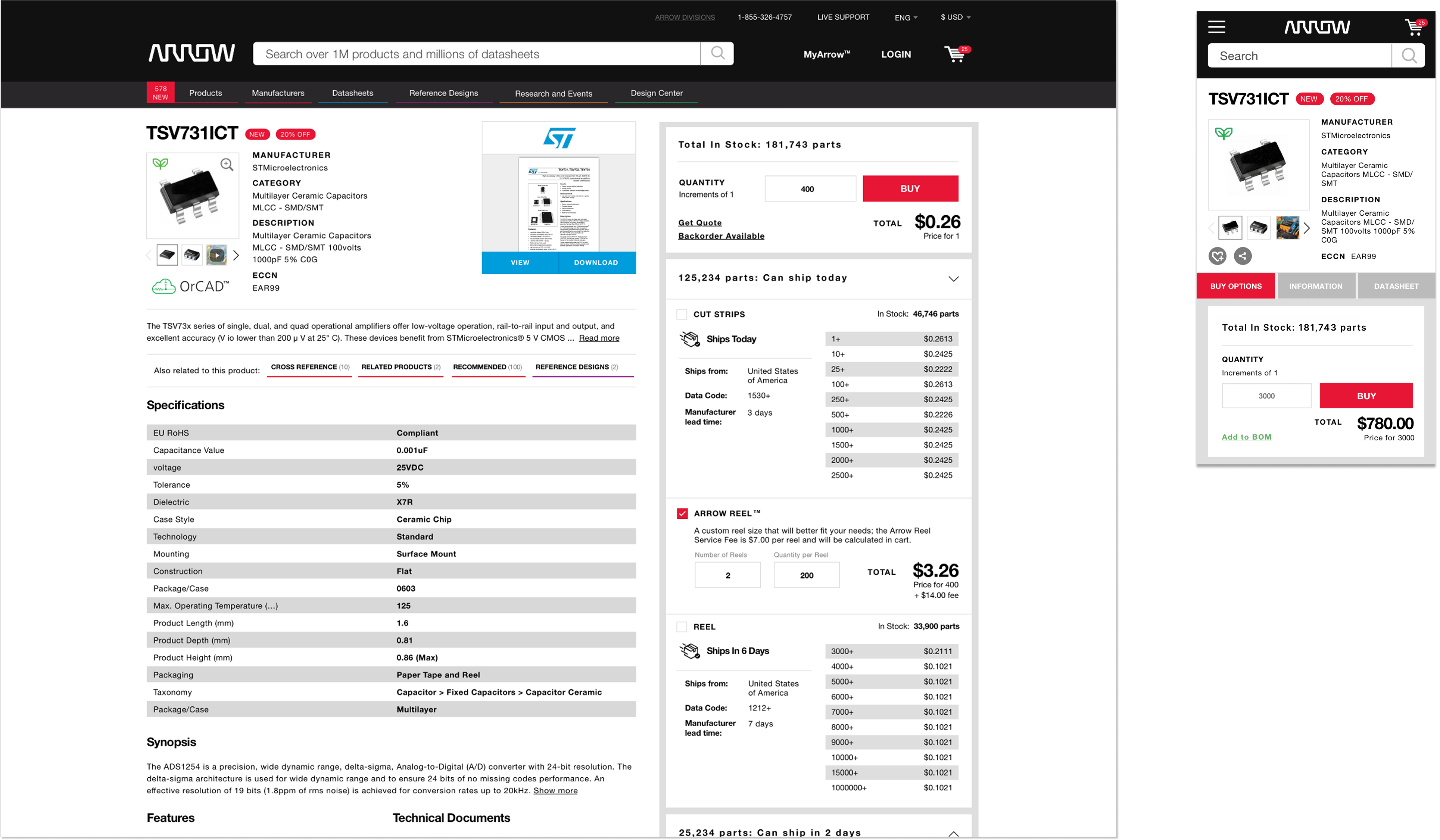
Problem
Excessive buying options, poor data organization, and unclear messaging make the PDP experience confusing, contributing to a 71% abandonment rate, despite being one of the most visited pages on Arrow.com.
Goal
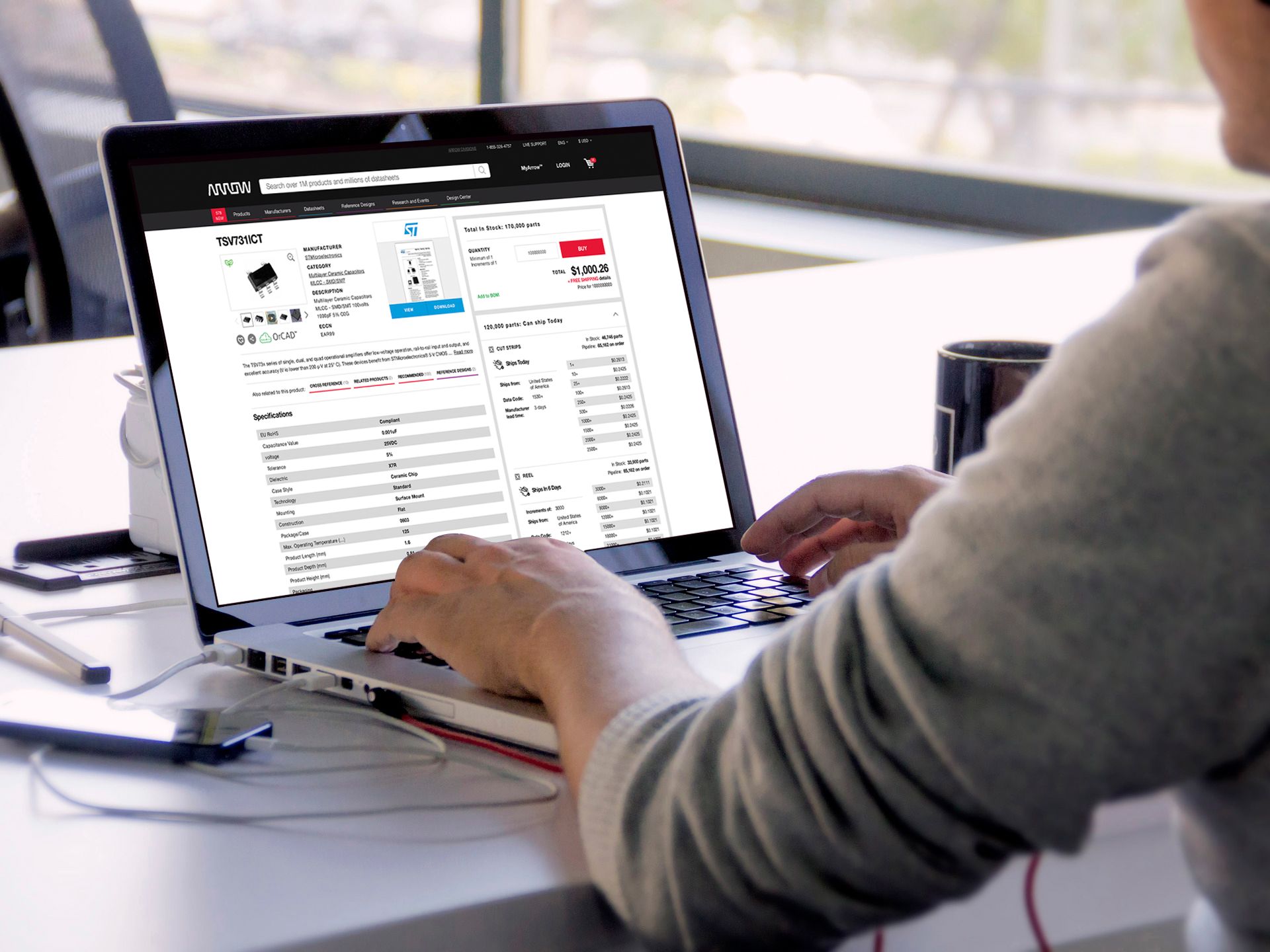
Increased user confidence on the product detail page, reducing time on page, session length, and abandonment rate, while driving higher revenue and average order value (AOV).
- DELIVERABLE
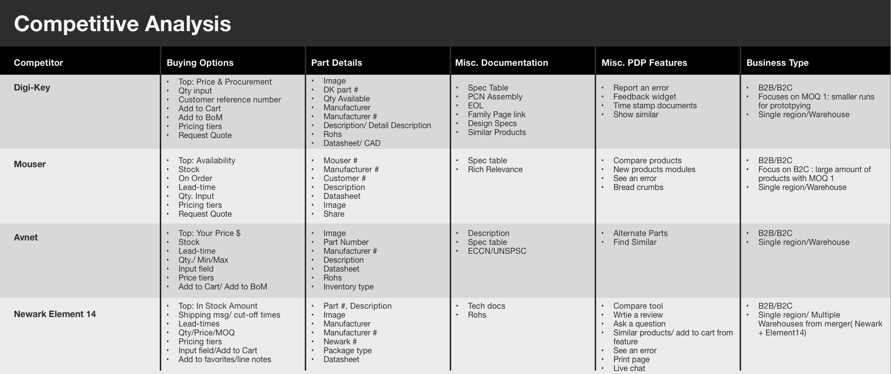
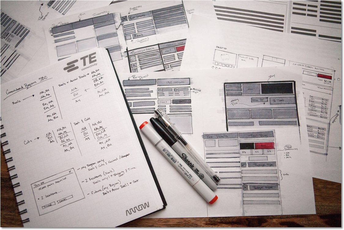
- Competitive Analysis Study, User Research, Requirements Gathering, Sketching, Design Comps & Prototype
- ROLE
- User Research, Visual Design, Design Strategy & Interaction Design
- TOOLS & SOFTWARE
- Sketch, Usertesting.com, UCD Research Methodologies, Decibel Insights & Google Analytics
In 2.5 Years
Optimizing PDP
Increase Revenue
from ~$40K to $2M
Increase AOV
from ~$100 to $330
Reduce ToP
from ~3min to 1min

Challenge
The challenge was to transform Arrow.com into a standard eCommerce buying experience. At first glance, the project seemed straightforward. As a newly hired designer at a global billion dollar company, how naïve could I be? The answer: quite a bit.
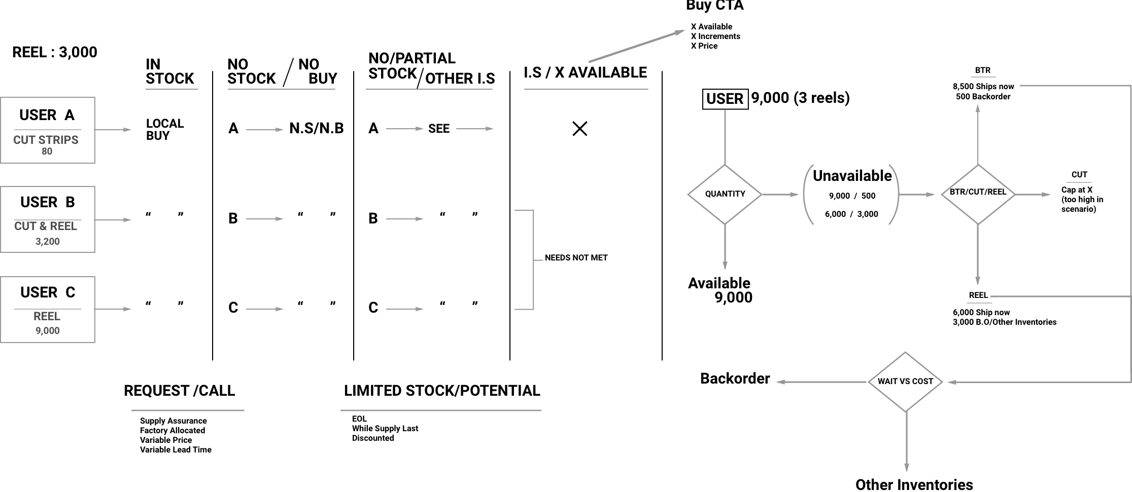
After an initial kickoff meeting with my product owner, I began scheduling one-on-one sessions with key stakeholders—people managing backend data feeds, inventory systems, and frontend development—to better understand the underlying complexity and how each department influenced the user experience on the Product Detail Page.
One key insight from these conversations was how Arrow.com relied heavily on technology, processes, and frameworks from Arrow Core, the company’s internal B2B platform, to get the site up and running quickly. While this approach reduced time to market, it also introduced significant pain points and technical debt that required close cross functional collaboration with the Arrow Core teams to resolve.